Google Analytics Responsive Design Dashboard
 A notebook you'll actually carry every day.
If you are wondering whether or not it is time to go responsive (the answer is yes you should by the way) then why not let your site analytics answer the question for you. We have built a ready to use google analytics dashboard that lets you see how your site is stacking up across desktop mobile and tablets.
At the moment you’re in one of two situations,
- You are looking to responsive but your not sure if you’re traffic warrants the effort (trust me, it’s worth it)
- You’ve just gone responsive and want to know how well your performing
Fortunately this report can be used for both.
Check out how the report looks below and read on to find out more.

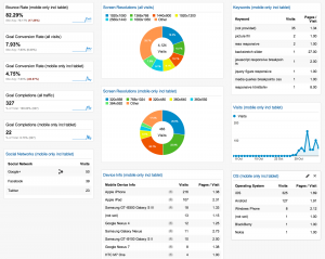
Report Overview
The report is split into a couple of sections, lets take a closer look at each of them.
Bounce Rate (mobile only incl tablet)
This number is a little high at the moment. This is a good indication that your website isn’t performing well across the mobile/tablet devices and you should definitely implement a responsive design. This also shows the site average (based on total views from all devices) so you can see if you’ve improved.
Once your site has been responsified you should see this trending downwards.
Goal Conversion Rate (all visits)+(mobile only incl tablet)
This is actually two reports. The first shows average of Goal Conversions for the entire site (all visitors) while the second one highlights the goal conversions for mobile and tablet devices. As with the Bounce Rate above the site average is actually shown in the mobile specific report but I wanted it to be more clear about where the conversions were occuring.
This report only shows the total conversions rather than a specific goal, however you can update this to show any particular goal if you need to.
Once your site has been responsified you should see this trending upwards.
Goal Completions (all traffic)+(mobile only incl tablet)
Again, this is actually two reports and is very similar to the Conversion Rate. The reason I included this is because for me it was important an understanding the total number that the conversion rate is based upon.
Depending on what your goals are you should see the gap between the Goal Completions shorten (hopefully with the mobile increasing).
Social Networks (mobile only incl tablet)
People spend a lot of time on their phones accessing the web, and more often these days they use Social Networks like Facebook, Pinterest, Twitter, G+ to consume information they’re interested in one location. This means that whatever content you are sharing on your social network, or you are allowing others to share, will most likely be read and followed on a mobile device.
This report shows the number of visits that have originated from Social Networks via only a mobile/tablet.
Screen Resolutions (both reports)
I wanted some colour in the Dashboard and I love a good donut chart :)
The first report outlines the most frequently sized screen resolutions that access your site (unique visitors). You should note that this is **screen** and not **viewport**, google analytics is unable to report on the viewport of the browser (although there are some techniques if you want to collect the data yourself).
The second report shows the screen resolutions of tablet and mobile devices. You don’t need to worry about the viewports on these because the browser opens to the windows full width.
Just out of interest I’ve included the most likely candidates for each of the resolutions
- 320×568 = iPhone 5x
- 768×1024 = iPad
- 320×480 = iPhone 3/4x
- 360×640 = Nokia/Samsung/SonyEricsson
- 360×592 = Galaxy Nexus
- 384×592 = LG Nexus 4
Device Information
This gives us a quick overview of the types of devices that are accessing the sites. You should pay more attention to the device widths to make sure you test your layout on those to start with, but this is always a “nice to see what the industry is doing”.
Keywords for mobile
After Google removed the search referrer from anyone that was signed into their google account when searching (nearly every person ever) this is not as useful, but I’m waiting to see if we have access to the keywords tracked through Webmaster Tools to try and improve the usefulness of this widget.
I think it’s a good distinction to see how people are searching on mobile because it can very often be different to the search on desktop.
If your users aren’t signed in to Google then the chances are your keywords are a little more varied then mine.
Visits – mobile and tablet only
This gives you an overview of your traffic from mobile anyway. I’m going to be making a few adjustments to this dashboard and include these along with the Desktop traffic so you can easily make a comparison.
I expect that the mobile/tablet traffic will steadily grow beyond that of the desktop… but don’t wait that long until you go responsive.
Operating System
This is more out of interest then anything else but can help you make your decisions around the types of devices that you’re going to want to test your responsive website on.
Although we are building responsively and it will work across a variety of viewports there is still the real life form factor that goes along with testing on actual devices, on real operating systems.
This report gives you the top list that you should start targeting… and remember there’s plenty of Device Labs around that can help you out. (We even have one here at Squiz).
Import the Report from the gallery
Any Dashboard feedback?
If you think something is missing from this Dashboard then hit me up on twitter and or email me and let me know, it’s there for you to use and I’d love to make it better.