Sometimes it can be difficult to get started on a new approach to designing and building websites, especially when dealing with Responsive Design and trying to break out of the mould.
If you would like to recommend a site to be added to this list fill in this form and let me know.
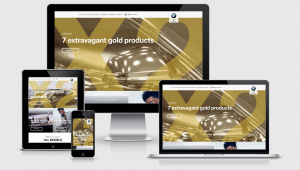
Let this collection of responsive designed websites across a variety of website types help get your creative and developer juices flowing. Each site features a screenshot across 4 device widths and you can see the media queries, viewport and resources that have been used to create the site.
Susan J Robertson
Susan Jean Robertson site across four viewports
Read More
Milwaukee Ballet
Milwaukee Ballet across 4 viewports
Read More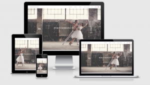
Rankesh Design
Rakesh Design Portfolio RWD Example
Read More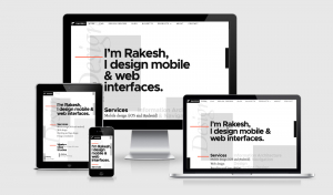
CSS Conf Europe
CSS Conference EU Example Site
Read More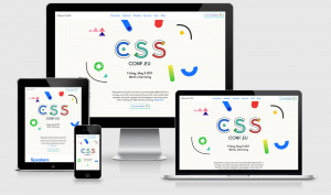
Sara Soueidan
Sara Soueidan Portfolio Site Across Four Viewports
Read More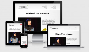
Melanie Daveid
Melanie Daveid site seen across four breakpoints
Read More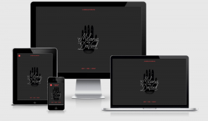
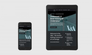
Victoria & Albert Museum
Victoria and Albert Museum across mobile and tablet views
Read More