RWD Newsletter #20
 A notebook you'll actually carry every day.

This week saw the Responsive Web Design Online Summit organised by Environment for Humans. I’m not going to say it was an easy conference as it went from 09:00 – 17:30 Central Time (USA) and I live +9.5 in Australia (in other words 23:30 – 07:30). Thankfully the conference was SUPER AWESOME
so the fact that I didn’t sleep wasn’t an issue. Although I wanted to include everything I learned from each session I’m going to have to spread it out and cover it next week because to be honest I learned too much. This week I’ll kick it off with the first session from Trent Walton on RWD Workflow….
Session 1 – Trent Walton – RWD Workflow
- back in the day Trent built sites IDENTICAL to the design in Photoshop. CSS & HTML was there to execute the design, but the creative work was all done in photoshop. What you saw in photoshop, you saw in the browser. On May 25th 2010 Ethan ruins everything by writing RWD on A List Apart.
- Initially there were concerns with this new way of creating sites. Fear about the process, feat about the creative limitations, dislike for squish layout changes.
- RWD is not a bolt on. It’s not like border-radius or web fonts that can be bolted onto an old design to make it better (although Ben Callahan later shows how you might bolt on RWD).
- DoLectures.co.uk was the first RWD Site built by paravel from the beginning. At each step of the way they realised this wasn’t that difficult to do, lets do it all the time.
- Paraval start with the max-width design and work smaller. A lot of talk around mobile first but for Paraval it was a more creative place to start within Photoshop. It’s about what works best for you and the client.
- Creativity and Design must play a part in every piece of the RWD Process.
- To think about the web responsively is to think in proportions, not pixels.
- A flexible Foundation. If you’re using a pixel for anything, don’t.
- Tips for flexible, background-size, text-shadow, border-radius (not images), use % percentages (especially for grids and layout), em based on current font-size, rem based on root font-size; vw, vh, vmin (% of view port size, this is like… the future), pxtoem will help you make the calculations
- Use icon fonts – shifticons, pictos, symbolset. Github have a great article on Octigons and so does Chris Coyier.
- Don’t settle for what’s current. Experiment, prototype, share.
- As the layouts are changing it is important that the message is still holding true, don’t let it get too squishy. Things need to stay proportional in order of importance.
- How do you deal with paragraph text? According to web typography 45-75 characters per line is perfect. Technique is to include an asterix * in the text to ensure that they never appear on the same line. As you get to a larger layout you should jump the fontsize to ensure the asterix remain on
different line. - You need to trade control that you have in photoshop for a new kind of control using flexible images, grids and media queries to build not a page, but a network of content that can be rearranged at any screen size to best convey the message.
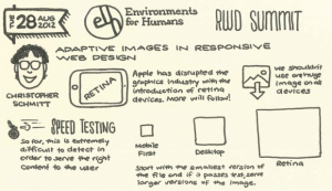
Pretty awesome right! And that was only the first session. Benjamin S. Norris also produced someamazing sketchnotes which he was kind enough to give us permission to use for our header image this week.
Check out the rest of his notesand stay tuned for some more overviews from the RWD Summit. And finally on the Summit, I putOne less jpeg
together as a test to see the affects of too many images or javascript on a page after Dave was retelling stories of people complaining about adding javascript to the site. Chris Coyier piped up in the comments with “onelessjpg” so I thought I’d see how much difference it made…. images vs javascript
All that and we haven’t even started with this weeks links!?!?!?! We had better get started then…
Headlines
Responsive Design case study
We featured this site a while ago and were very impressed with the work that had gone into the finishing product. In this article by Built by Boon then take a detailed look into what it took to deliver the project. It’s a wonderful and very detailed review of a responsive design project and for anyone
that is embarking or looking to start one this is a must read.
Complex Navigation Patterns for Responsive Design
A few months ago Brad wrote an article on navigation patterns with RWD. That article focussed on the basic navigation that we see for most simple sites, but as he points out in the latest article sometimes you just have a complex navigation.
HTML Responsive Images Extension
This proposal adds new elements and attribute to [HTML5] to enable different sources of images based on browser and display characteristics. The proposal addresses multiple use cases such as images used in responsive web designs and different images needed for high density displays. This has caused
a MASSIVE stirr and a bunch of blog posts. Check out the proposal and read what others have to say about it below.
How do you pick responsive images breakpoints?
This is the question that has been troubling me. If we’re going to tell people creating responsive designs that they shouldn’t tie their image breakpoints to their designs, what guidance can we give them on how many file sizes make sense and when should they switch to a different file size?
Articles
How to use Google AdSense Ads with Responsive Web Design
If you’re using Google Adsense on your responsive site, or if you’re holding off going responsive because of your adsense then you need to check this out. The script allows you to switch between ad units using window.innerWidth. Great technique but be careful, I’m not sure if it breaks any of googles
ad rules (anyone from Google want to chime in?)The Business Case for Responsive Web Design
An older post but really worth a read if you’re considering pitching a responsive design internally.WordPress Embraces Responsive Design With New ‘Twenty Twelve’ ThemeWordPress 2012 goes Responsive Design.
Gridset and the Red PillMark Boulton gets all Matrix on our ass with this overview of the Gridset and how we sometimes might look back on a simpler time… but of course the future is
too exciting to do it for too long.Responsive Web Above The Fold
In a guest post on CSS-Tricks Arley McBlain tackles the issue of the fold. He looks at maintaining important elements within view as the viewport shortens. It’s an interesting article and the static menu example for wordpress is ingenious.
Images
Responsive images, the picture element and the W3C: This is how you deal with Hixie and WHATWGMarc Drummond takes a look at the new draft for the picture element and explains
how the process came about while having a bit of a go at Hixie. I don’t agree or disagree although Bruce points this out below.On the publication of Editor’s draft of the <picture> element
Bruce Lawson is cool… and smart. In this article he doesn’t voice too many preferences for the image debate however he covers off exactly what the HTML REsponsive Images Extension submission is and what people are saying about it now.What a holy grail image format would mean for the browser’s lookahead pre-parser?What is the holy grail responsive image format? In nearly every
discussion about responsive images, the conversation eventually turns to the idea that what we really need is a new image format that would contain all of the resolutions of a given image.
High DPI Images for Variable Pixel DensitiesSeeing as we’re covering quite a bit of information on responsive images today I thought we’d cover high dpi images and pixel densities. HTML5 Rocks this one out of
the park (as usual)
Resources, Tools & Tutorials
ResourcesDevice Viewport WidthsIf you have a smartphone or tablet (or an Android powered, internet enabled refridgitoaster,) add its viewport sizes to this
spreadsheet on Google Docs. (Then print it out and tape to that refridgitoaster.)HTML5 Boilerplate V4.0
HTML5 boiler plate gets used a LOT on the web, and definitely on responsive website builds. Even if you don’t use the full boiler plate you’re probably pinching a part of it to get started. Now they’ve released version 4.0HTML5 Boilerplate helps you build fast, robust, and adaptable web apps or sites. Kick-start your project with the combined knowledge and effort of 100’s of developers, all in one little package.Responsive Web Design Sketch Sheets
Some printable sheets for wireframing for responsive layouts, with corresponding Photoshop templates made by James Brocklehurst.
Tools
SVGeezy – a JS plugin for SVG fallbacks A simple JavaScript plugin which detects SVG images on your website, and automatically “looks” for a standard image fallback for those older, less capable browsers. Those browsers
need lovin’ too dawg.
RubberBand
—
So, what is RubberBand? Well, it’s a light-weight, versatile and simple to use tool to help you develop responsive websites. Below are a few features:Duplex – Retina Image ConverterDuplex is a very simple Macintosh application that handles batch scaling of images. The main purpose of Duplex is to provide a quick way for designers or developers to produce assets to improve
the look of their existing sites on retina displays.
FitWeird by davatron5000 FitWeird helps you add breakpoints when things get weird. It’s about as dumb as it gets. Resize your window, it tells you dimensions in PX and EM. No on-screen rulers, no typing a URL.
Click the bookmarklet and a little doodad will show up in your browser. Bingo bango.
Tutorials
Getting WordPress to play nice with responsive imagesIf you’ve got a website chances are you’ve got or worked with wordpress. Keeping in theme this tutorial gives you a few
pointers on how to set up responsive images within wordpress.Automatic Conditional Retina Images
One line of JavaScript and a few mod_rewrite rules and we have no fuss Automatic Conditional Retina Images. No DOM crawling. No redundant requests. No server-side scripts. No cookies? No problem, they just get the original image.Where print fits in responsive web designPutting your print styles at the bottom of your single column stylesheet means you are only pruning the styles set at a this level
before horizontal layouts occur meaning they are will be quicker to produce, easier to maintain and lightweight. Responsive web design has a knack for traversing mediums, lets take advantage of that.
New sites & Inspiration
The Great Discontent (TGD) This is a beautiful site. The design itself is marvellous and it responds to smaller screens while still keep the visual hierarchy. To make
it even better the interviews are with some of the best people getting around. If you’ve just launched a site or are getting ready for a launch thensend us a link
to the site with a bit of information about the choices you made in the build and we’ll feature you in this section.
Wrapping up…
I’m going to put two options to you for next week. Please click on your preference to post it to twitter.
- Send another email midweek with the wrap up of the RWD Summit & send the usual end of week links, or
- In lieu of next weeks links send the RWD Summit instead
If you want Option 1 thensend me a tweetor
post on Facebook. If you’re in favour of Option 2 you don’t need to do anything. That’s right, if you want extra content from me then I at least demand you click a button :)
