RWD Weekly #264
Welcome to RWD Weekly edition #264.
Headline
Please Make Google AMP Optional
I’ve featured articles from Alex previously around the AMP argument, and this time around he’s making even more sense. It would be great to have the option to switch AMP off… after all Google are trying to improve the User Experience with this approach, so if the improved user experience is not using AMP then let the masses have the opportunity.
Powerful New Additions to the CSS Grid Inspector in Firefox Nightly
Last week I talked about making a move over to Firefox for more of my day to day browsing but staying in Chrome for the development work. With each release FF Nightly has some increasingly amazing tools in the dev toolbox, and while Chrome is still my favourite for performance reviews these updates make Firefox the best browser to get to terms with and understand Grid layout
Sponsor
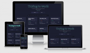
Responsive Design Notebooks — 25% discount
The three tenets of Responsive Web Design can now sit comfortably in your back pocket. These notebooks are perfect for sketching quick layout ideas and, of course, explaining what RWD is to clients and colleagues.
Use code RWDWEEKLY for 25% off!
Articles
Responsive Design in Sketch — Part 1
With the latest version of Sketch (v.44), the group resizing feature has been updated. Even though there is no fundamental change, we have a little bit more control over the feature now.
Leveraging the Performance Metrics that Most Affect User Experience
Tracking the performance of your site or app can be as simple as looking at the page load time, but, that doesn’t tell the full picture about what is going on. You should be monitoring a number of factors to properly understand your users’ experience.
A New Sidebar
An overview of the new sidebar design (our site of the week) from the designer himself, Sacha Greif.
User Story Map: the first UX map in a product’s life
Developing a user story map will help you focus your projects requirements and get everyone working towards the key goals of your users.
Designing The Perfect Accordion
Vitally looks at a number of best practice accordions on a variety of different sites from travel, email, pricing and e-commerce. A great source of inspiration if you’re looking at this issue at the moment.
Aspect Ratios in CSS are a Hack
Bram looks at a number of different approaches to create aspect ratios in CSS before closing with the hint that we could see something like height: aspect-ratio(16/9) which will allow you to calculate the height based upon the width.
Learn from customers faster with NomNom //Sponsor
Get all your customer feedback and user research in one place.
Tutorials
Using CSS variables correctly
CSS Variables (also known as Custom Properties) are now supported in all modern browsers and people are starting to use them production. This is great but they’re different from variables in preprocessors, this article looks at how they can be more powerful.
Responsive Images, WordPress, and Cloudinary
An (almost) hour long chat screencast between Eric Portis and Chris Coyier about responsive images. There’s a big focus on the Cloudinary tool in here as well, something which I started using and need to get back to shortly.
Handling Long and Unexpected Content in CSS
This is a classic issue that occurs when things move from static photoshop designs and into production websites — the perfectly written ‘design’ copy is updated to real titles and real peoples names. These tips will ensure your designs handle any web copy.
Modular Scale with CSS variables
This is a great example of how to create variable responsive font sizes using CSS Variables and calc.
Server-Side React Rendering
One of my biggest bug bears with tools like React is the lack of HTML that comes down the wire on the page load… i.e. <div id=”app”></div> can be all you get sometimes. There is a way to enable server side rendering.
How I Built a Pure CSS Crossword Puzzle
I remember being impressed when the Guardian included a crossword as their offline page with service workers, but this crossword in CSS is taking it to the next level. Very cool.
Tools/Resources
Website Speed Test
Optimizing images can significantly improve Web page load time, resulting in improved user retention and satisfaction. This tool provides measurable and actionable information about how to go beyond simple compression: discover how changes to image size, format selection, quality and encoding can dramatically improve page load speed.
Syncope
Syncope is a WYSIWYG tool that helps web designers and developers chose the optimal vertical rhythm of the typography for their web pages.
Online WebP Converter
If you’re looking to include <picture> element to provide different image types then WebP is a great option to include. This online tool helps you convert your existing PNG or JPG over to WebP
Presentations & Podcasts
WebVR
I love this animated gif showing the progressive enhancement options we have when it comes to using VR. While it’s great to put Google Day Dream on with a phone the same content can be consumed on the desktop or tablet as well as the phone without a headset.
Empathy and Web Performance
A great talk by Lara Hogan on web performance from Webstock 2017.
Style Guide Podcast
The style guide podcast is back for another season with hosts Anna and Brad discussing how things have evolved.
Jobs
Software Engineer Intern Fall 2017
I’ve said it before and I’ll say it again… I love MailChimp! If you’re looking for your first position in the industry then why not throw your hat in the ring as a software engineer intern this fall?
See you next week!
Cheers,
Justin.
 A notebook you'll actually carry every day.


