RWD Weekly #396
 A notebook you'll actually carry every day.
Hey everyone and welcome to Responsive Design Weekly #396.
No beating around the bush this week, no extending it out unnecessarily with a long introduction. This week isn’t going to be the time for a long introduction. Instead, we’re going to jump straight into the links so you can wrap up your long week with a bit of reading and learning.
Sure, we could do a long introduction and talks briefly about the different areas that we’re focusing on this week, but instead I just want you to enjoy the content that you came here for.
Dammit.
Right, let’s get linking!
Article
Redesign: Gridniking
Frank Chimero’s new redesign has been a fascinating read. This article he looks at how the grid will come together, and if you like that check out his post about the footer too.
Size Does Matter: LEGO’s 300MB Android App
We do everything we can to try and keep our web pages until 2mb, but native apps are often a hundred times that size (and sometimes more). This article looks at the poor planning for a lego app and why it’s important in every context to ensure we deliver things as lean as possible and only download what you need when you need it.
Service Worker Development Best Practices
If you’re developing PWA’s or using Service Workers for performance reasons then this article is for you. Chris Love has developed more than 100 PWA’s and has learned a thing or two about their application and testing.
Squarespace, Wix, & Weebly: Accessibility Review
During the Super Bowl last weekend there was a Squarespace ad which sent Terrill down a little rabbit hole of accessibility checking across some of the most popular “build your own” website tools.
Playing with CSS Grid
Snook is playing around with CSS grid to list out a bunch of restaurants that he’s been to. There’s some randomness achieved through a clever use of nth-child too.
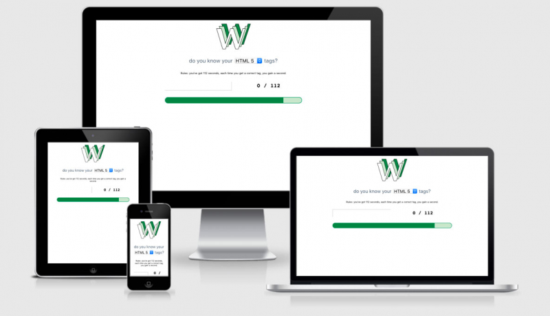
What Flushing Toilets Taught Me About Web Design
By using words and icons together, putting space between interactive elements and applying minimum touch sizes, and removing unnecessary distractions we can make the interfaces we design easier to understand and use.
I’ll never look at another toilet the same.
CO2 emissions on the web
I looked at this a couple of weeks ago and found that the RWD site was doing better than 100% of the other websites. Turns out that was a glitch in the system. When I looked again it sits better than 90% of all websites out there. Although good, there’s still things that I can change to improve this sites global footprint. This article looks at how just a small 1kb change can have more impact than switching to a hybrid car.
Tutorial
Sticky Table of Contents with Scrolling Active States
If you’ve got a really long content page spread out with headings you can place a static navigation element to the side, and then using IntersectionObserver follow the headings as you scroll. Sound complex? It’s not, and Chris has a codepen to show you.
Quick and Easy Dark Mode with CSS Custom Properties
So elegantly simple to apply a dark mode to your website by declaring colours using CSS Variables and then using the @media (prefers-color-scheme-mode:dark) {} media query to include dark overrides. You can also start dark, and use (prefers-color-scheme-mode:light) to override those ones too.
A new technique for making responsive, JavaScript-free charts
While the title cries “Javascript free” the tutorial shows you how this can be done with SVG and JavaScript… granted from the server side rather than the client side. Interesting approach though, and it was nice to see in the comments that someone was trying to reproduce this using data tables as well.
Magic Flip Cards: Solving A Common Sizing Problem
Flip cards are a great way to showcase lots of information while still keeping the initial view of the site fairly straight forward. You still need to keep in mind that people won’t automatically know there’s content on the flip side of those cards so keep that in mind as well.
CSS Positioning
Positioning things within a browser is easy… but positioning where you actually want them to go…. well that’s a whole different story. This tutorial will help take the complexity out of positioning and make it an easier process for you to build your sites.
Get Creative With a Free .design Domain Name!
.design is a domain that reflects what you do as a designer. Unlike .com or .net, a .design domain name is more relevant to the design profession and it helps with your branding. It looks great on business cards, resumes, and as a custom email address. It also comes with free email hosting, SSL Security, & a free site builder. Get 1 year free today!
// sponsored
Tools and Resources
unDraw – Open source illustrations for any idea
Create better designed websites, products and applications. Browse to find the images that fit your messaging, automagically customise the color to match your brand and use it as a normal image, embedded code or directly in your design workflow.
Tailwind CSS Release v1.2.0
HTTPS is Easy!
I don’t like to say things are “Easy” because for someone getting started things are rarely ever easy. This is the name of a series that will help take you through the steps you need to get your site up and secure.
a11y.css
This can be used as either a browser extension or something you add as another CSS link. It provides a number of visual references where there are accessibility issues, I.e. placing a red border around images with no alt text.
Finally
The loading bar in 3D
I knew there was something up with the loading bars, now I know why.
That’s all for this week. As always thank you to those that sent through link recommendations, if you’ve come across something or have written something please send it through.
Cheers,
Justin.