RWD Weekly #410 Interview Series with Ethan and Ire
Hello and welcome to RWD Weekly Newsletter edition #410 and the continuation of the interview series.
This week we’re taking on two interviewee’s in the shape of Ethan Marcotte and Ire Aderinokun.
Each week I pose the same seven questions to a range of different folks working in our industry and we get to hear their opinions based on their own experiences working on the web. Not all questions fit all of our interviewee’s so if you notice one of them are missing it’s because they decided they didn’t have much to say on the topic.
Without further ado, let’s start off with Ethan…..
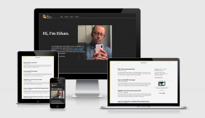
Ethan’s Interview
Ethan should need no introduction, he was the first to coin the phrase responsive web design and developed the approach that quite literally changed the face of web design.
Always with wise words, let’s see what Ethan has to say.
How do you find working with clients these days? Is responsive something that you have to sell in any more or does everyone get it now?
As it happens, I just restarted my design practice in January, so this question’s timely!
Generally speaking, most of the work I do is less focused on selling folks on a responsive approach, and more on helping them with implementing it effectively. That might involve hands-on design or front-end work, sure. But in more recent years, more of my time’s spent helping teams to define (or refine) the design system that shapes their responsive products.
In both cases, though, that usually involves looking at how the work happens internally. My projects still involve producing artifacts—like building responsive layouts, or creating a library of reusable design patterns—but I’m doing more work thinking about the broader organizational context those artifacts have to live in. And most of the time, that’s the real system we’re designing for.
What is it that you find the hardest when speaking with clients from a site design/build point of view, and how do you go about explaining why it is important?
I’ve written about this elsewhere, but it often comes down to a few words:
“Mobile, tablet, and desktop.”
Now, these are perfectly fine words! But they tend to conceal a lot of assumptions about how to design and build for the web. “Desktop” doesn’t mean someone necessarily wants a denser, more crowded interface, nor does it mean they’re on wifi. And “mobile” doesn’t always mean a touchscreen, nor does it mean reliable 4G speeds—nor does it mean someone can see the screen like I can.
It feels like a small point, I know. But if we’re going to design a web that works for everyone, everywhere, then we need to look beyond some of these shorthand device categories—and beyond our own biases—which can hinder more than they help.
So much has changed since your eureka moment, what are your go to implementation methods for responsive sites? How do you handle layout, typography, images, video etc?
For me, the broad strokes haven’t changed much since the original article: every responsive design still has a fluid grid, flexible media, and media queries.
But my goodness, the details have changed in a million different, wonderful ways. CSS Grid and flexbox are new since the article, and remarkable—as are responsive images, variable fonts, CSS custom properties, and on, and on. Not just in terms of how they’ve changed the way I build layouts for the web, but I find they’re (slowly, gradually) rewiring the way I think about design for the web. It’s been a slow, long, rewarding journey.
What are the top three issues you’re still facing when building a responsive site?
- The web is a woefully, horribly inaccessible place, and every working web professional needs to do their part to fix it.
- I dearly, desperately would like container queries.
- See item #1.
We started off with lots of m.dot.sites when mobile arrived. Google was a huge part of changing that approach by saying that all content should be found on a single URL. One true source. In recent years Google have incentivized the AMP Framework as a way to provide a new/better experience to mobile users. What are your thoughts?
I think Google AMP is yet another sign that our industry desperately needs proper regulatory oversight.
Look, I firmly believe that the web is far too slow for far too many people. But let’s be clear: in addition to bringing back the device-fragmented, “m-dot” experience of yore, AMP doesn’t really make the web faster. Companies are choosing AMP because Google integrated it into their search results. They can’t possibly refuse the promise of better search placement. Put another way: they can’t possibly refuse Google.
This is, in a nutshell, the problem: AMP wouldn’t exist without its proprietary integration into Google’s search results. That’s why I believe AMP represents an abuse of Google’s dominant position in the marketplace
Prediction time. What are we going to see towards the end of 2020 and into 2021?
There’s one thing that gives me hope in these weird, bleak times: the push for greater workplace organization. After victories at Kickstarter and at Glitch, our industry has its first two unionized tech companies of the modern era. And from the Google walkout to strikes at Instacart and Amazon, tech workers are banding together to address inequality in their workplaces, and to protect each other. This kind of solidarity is incredibly inspiring, and I can’t wait to see where it takes us next.
…oh, uh, and I hope we’ll have two working subgrid implementations. Container queries would be marvelous, too.
Thank you so much for your time, if our readers want to learn more from you where can they track you down?
Thank you for asking! I’m available on Twitter as @beep. I also run the @RWD account, where I post responsive-related stuff. But the best place to keep tabs with what I’m doing is on my site, ethanmarcotte.com.
And thank you so much for taking a few minutes to chat, Justin! It was a real pleasure to speak with you, as always. Hope to do it again soon.
Ire’s Interview
Ire has been dazzling me with her writing on https://bitsofco.de/ for years. It’s rare that anything Ire writes fails to make it into one of our weekly newsletters so I was delighted when she accepted the invitation to share some thoughts with us.
So much has changed since your Ethan’s eureka moment, what are your go to implementation methods for responsive sites? How do you handle layout, typography, images, video etc?
Even though I usually start by developing the desktop version of a website, my CSS implementation is always mobile-first. This means that the default state of my CSS and HTML, without any media queries or additional code, is the mobile design. I do this by making sure the layout makes sense on mobile, even if CSS is not loaded at all. My media queries are always targeting larger devices (i.e. min-width instead of max-width). Any media defaults to the lowest size/resolution, using the srcset attribute or the picture element with various sizes in order to provide assets for larger devices.
What are the top three issues you’re still facing when building a responsive site?
What I’m the most waiting for right now is container queries, I think it’ll really change how we write responsive websites!
We started off with lots of m.dot.sites when mobile arrived. Google was a huge part of changing that approach by saying that all content should be found on a single URL. One true source. In recent years Google have incentivized the AMP Framework as a way to provide a new/better experience to mobile users. What are your thoughts?
I believe with the original approach that all content should be found on a single URL, at least when it’s on the web. I understand the approach of providing an AMP version separately when it was a new product, as it’s easier to experiment when things are separate, but I would like to see us go back to the original approach.
As a business/product owner, what is the most frustrating thing you find trying to take a product out across today’s diverse device landscape?
Trying to manage all the different input devices people can use across different devices. It’s really difficult to, in the same codebase, manage people using a pointing device on a large desktop machine and people using their fingers on a tiny mobile screen. I think it’ll be great to have better detection of the input device users are with, in order to better cater the experience.
Thank you so much for your time, if our readers want to learn more from you where can they track you down?
You’re welcome! You can find me at @ireaderinokun on Twitter. And my blog is https://bitsofco.de
Finally
That’s all for this week. I’ve got a pile of links that I’m itching to share with you so we’re going to condense or final few interviews into the next two weeks.
Next week we’ve got Brad Frost lined up along with another special guest.
See you next week!
Cheers, Justin.
 A notebook you'll actually carry every day.


