RWD Weekly #421
 A notebook you'll actually carry every day.
Hello and welcome to RWD Weekly Newsletter edition 421.
This week we have a new treat from the very talented Nicholas Rougeux who has produced my favourite deep dives into a subject, but there’s already a couple of links below so let’s not go into too much detail here.
Let’s get into our links!
Headline
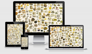
Making of British & Exotic Mineralogy
The work that comes from Nicholas is up there with my favourite pieces of work produced on the entire internet. He provides all the “how’s” for putting together the project and also produces an amazingly beautiful and informative piece of art/design at the end of it. I’m working on something like this for the Origin of Species, I’d love for things like this to end up as my day job 😂
I’ve also realised that there are likely to be hundreds/thousands of people in the world that are producing sites like this. Do you have any favourites? I’d love to hear about them and spread the word here so please hit reply and share a URL.
Sponsor
Accessibility is Key (and Free!)
It’s our job as designers to make the web work for everyone — and this new course Designing Accessible and Responsive Websites with Ethan Marcotte is a great way to get started.
In the time it takes to step away for lunch, learn a handful of best practices to help make a more inclusive web. Plus, earn a badge to share on social media when you pass the final exam.
Article
Why Medium is Not the Home for Your Ideas
I’ve always been a strong believer in self-hosting your own blog rather than publishing on something like Medium. This article does a great job going into the pros and cons of choosing your blog home.
Designing Adaptive Components, Beyond Responsive Breakpoints
In this article/written talk Stephanie Walter shows how she designs systems of components that go beyond responsive adaptation to different screen/viewport size and can also be used in different layout and container contexts.
Eliminating cold starts with Cloudflare Workers
Cloudflare is awesome. By utilising the initial connection for the handshake process in a https connection the CloudFlare workers can be primed with the content it needs by the time the request for the actual content comes back again. Ingenious. At the moment it only works at the domain level, but folder level is coming soon as well.
It’s time to lazy-load offscreen iframes!
After Firefox released the `loading=”lazy”` to help with native lazy loading of images Google added it to Chrome (and all chromium based browsers I suppose). Now, Chrome is bringing the same capabilities to Iframes which can shave off tonnes of time for your page load and improve time to interactive. This is great for things like YouTube embeds which, when using loading=”lazy“, has results resulted in up to 10 seconds of time saved on mobile devices.
Things I Wish I’d Known About CSS
Focus states, collapsing margins, relative and ch units… these are just a few of the things that is covered in this article. I knew about quite a few of these, but there was certainly some details I didn’t know (like the CH unit is the width of 0 which is 20-30% wider).
Tutorials
Getting the Most Out of Variable Fonts on Google Fonts
This is a neat tutorial on how Recursive Sans and Mono was developed and how you can now take it for a spin on Google Fonts. If you take EVERY one of the 64 weights/styles available the font weighs in at 6.4mb which isn’t practical, but you’re never going to use all that now, are you? A suitable suite of options enabled comes in around the 1/2 mb range.
Simple Image Gallery with display: grid; and object-fit: cover;
Using pictures from the birth of his little boy, this tutorial goes through the approach of putting together a nice gallery style set of images using Grid.
Inspired Design Decisions With Emmett McBain
Andy Clarke does it again with this great tutorial on laying out web designs, responsively of course, based around early print layouts. It comes with the history of why along with the modern day how.
Recreating Wildlife Photographer of the Year online – part 1
Last week (or was it the week before) we looked at the Clearleft article about their work on the Wildlife Photographer of the Year. This week we’re hearing from the team themselves from the Natural History Museum. The first part of this story focusses around the technology decisions.
Tools, Resources and Specs
this vs that – What is the difference between this and that in the front-end development?
Do you know the difference between :active and :focus, or Normalize vs Reset CSS? This site has a tonne of explanations about things that are pretty similar in web development but have some key differences and use-cases.
The Lean Web
The lean web is a free online book that has been written by Chris Ferdinandi and looks at how we have strayed from producing simple websites and now make even the simplest one-pager a behemoth with a JavaScript framework thrown in for good (bad) measure. You can buy a version of the book too and help support a wonderful teacher on the web.
Awesome GPT3 Resources
Awesome GPT-3 is a collection of demos and articles about the OpenAI GPT-3 API. This is brains behind the new AI we’ve been seeing which takes natural language queues to develop a website.
Tweet of the week
I had no idea we could use window.matchMedia In order to trigger JavaScript events based on the viewport size!
Finally
That’s all for this week. As always thank you to those that sent through link recommendations, if you’ve come across something or have written something please send it through.
Cheers,
Justin.