RWD Weekly #422
Hello and welcome to RWD Weekly Newsletter edition 422.
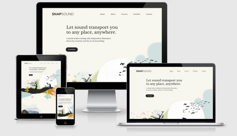
This week our feature site is a lovely creative motion studio. The header has a paper fold look about it, and the case study pages are really nicely put together. As you would expect from a motion studio, animation on the site isn’t left as an aftern thought and helps dazzle and delight as you navigate.
Let’s get into our links!
Sponsor
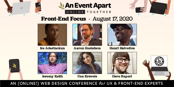
Learn what’s next in front-end development
Explore the latest in CSS advances, best practices in design principles, surviving audits, improving performance, and more at An Event Apart Online Together: Front-End Focus—a one-day online conference coming to a device near you Monday, August 17.
Save $50 with promo code AEAOTRWD
Article
The amazing power of service workers
Chris looks at a few fun things that you could do with Service Workers on your site today (based off the learnings from the very clever Jeremy Keith).
Virtual Tours of the Museum of the Fossilized Internet
Sometimes it feels as though we’re living in the future when you consider what we can do on the web compared with just 12 months ago, but it’s fun to imagine how people will look back on the early decades of the web when we get to 2050. This virtual trip is a little experiment in just that, with an focus on how wasteful we are with power to generate the tech we use today.
content-visibility
The content-visibility property is coming to Chome shortly and will help page load performance from within CSS alone. The new property will flag to the browser that it can skip the rendering work for its region until it’s needed. This means that if you’ve got a long list of blog posts, you could offset the render on those that are much further down the page allowing for the top blog post to complete rendering faster and provide a faster time to interactive.
Moving from Corporate to Contract
The pandemic might not be the best time to move to working for yourself, but it’s also a time when people are finding that they may be getting pushed in that direction. If you are moving from corporate work into freelance contracting these tips and tricks to make the most of your opportunities are great.
I’ve Only Gone and Redesigned my Website, Again
I love the story behind a redesign, and David Bushell has certainly delivered a few great overhauls in the past. Have a read through his design process and some of the new front-end techniques that he employed on the site.
Jetpack CRM
Automatic have introduced a CRM into their Jetpack product for WordPress. Similarly to the way that Jetpack already runs, you have an option as to which bits of functionality you want to run on your site. I’m going to take a look at getting this running to manage the sponsorship listings for this newsletter.
Tutorials
A Look at What’s New in Chrome DevTools in 2020
Although I use Firefox as my primary browser on the laptop and Safari on mobile and tablet, I do still have a lot of love for Chrome because of its Dev Tools capabilities. In this tutorial, Umar takes you through some of the best bits of Chrome Dev tools this year including some that I’ve not seen before relating specifically to accessibility.
A Lightweight Masonry Solution
A look at how to include the “behind a Firefox flag” and get Masonry running using CSS Grid. Seeing as you don’t want to explain to users how to do this to see your sweet new site with a masonry grid, Anna has also included JS fallbacks and without JS the layout still falls back to a regular grid.
The Making of: Netlify’s Million Devs SVG Animation Site
Zach’ s article on creating the OG images is great, but how did the whole site get put together? I’m glad you asked. Sarah goes through the clever implementation methods used to produce the million dev’s site out of SVG in this tutorial from CSS Tricks.
Bulk Generating OG Images
A neat little script that uses image magic and Eleventy to pull together dynamic OG images (the image that is used when sharing your articles on social).
Digging Into the Flex Property
Bit by bit, illustration by illustration, property by property, Ahmad goes through Flexbox and explains everything you need to know. From grow to shrink to basis, he pulls each element apart and gives examples about when best to combine values for a variety of outputs.
Talks
Designing Humane Web Experiences
Vitaly is one of my favourite speakers. I could happily watch his talks a number of times because they’re so JAM PACKED with valuable content that while I’m thinking about the consequences of one thing he is saying I miss out on something else. In this talk he reflects on how boring website design has become and what you can do about it.
Tweet of the week
Background shadow with filters
Drop shadow, the unknown (and better) version of the box-shadow (in some cases).
Whether or not it was a coincidence, this article from Michelle goes into lots more detail if you’re interested in learning more.
Drop-Shadow: The Underrated CSS Filter
I still remember when applying a shadow to an element was done with images and really hacky approaches, but when box shadow arrived in CSS it was so much more straight forward. Box shadow doesn’t always give us the results we’re after, but that is where the drop-shadow filter comes in.
 A notebook you'll actually carry every day.
