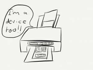
The printer is a device too!
Brad Frost created one of the more commonly used photos found on responsive design presentations (see below). This depicts the world we live in today which contains hundreds of devices with internet capabilities.

With every one of these devices brings the challenge for our websites to respond in a logical, beautiful and above all user friendly way.
The problem is that we’re focusing too much on the future devices and we’ve forgotten the devices that have been with us for years.
The Printer
While not the snazziest of devices connected to the internet it STILL is a device that can render our web pages, and unfortunately this is probably the most forgotten and least styled of all the devices around.

The Print Stylesheet
In October 2013 I did a talk at the Squiz User Conference on how to make changes to your website without actually changing anything at all. While preparing the talk I took at leaf out of another talk I had seen during dConstruct by Maciej Cegłowski, creator of PinBoard. The leaf I took was to provide the audience with something that they could use on Monday morning when they got back to work, and pass it off to their boss as it it was their own. For me this takeaway was the Squiz.io site.
I wanted it to be more than a website so I added some HTML5 editable regions to allow the reader to update the title and description, and then applied a Print Stylesheet so it was nicely formatted for then to print and pass off as their own ideas.
Here’s the simple but effective styles.
@media print {
  section { display: block; page-break-before: always; }
  pre code {page-break-after: always;}
  @page {
margin-top:0.4cm;
margin: 0.5cm;
}
p a, code, pre {
word-wrap: break-word;
}
img {display:none;}

pre a[href]:after {
    content: ""; }


pre abbr[title]:after {
    content: ""; }

pre   .ir a:after,
  pre a[href^="javascript:"]:after,
  pre a[href^="#"]:after {
    content: ""; }

.no-print {display:none;}

}
 A notebook you'll actually carry every day.
