Aids.gov
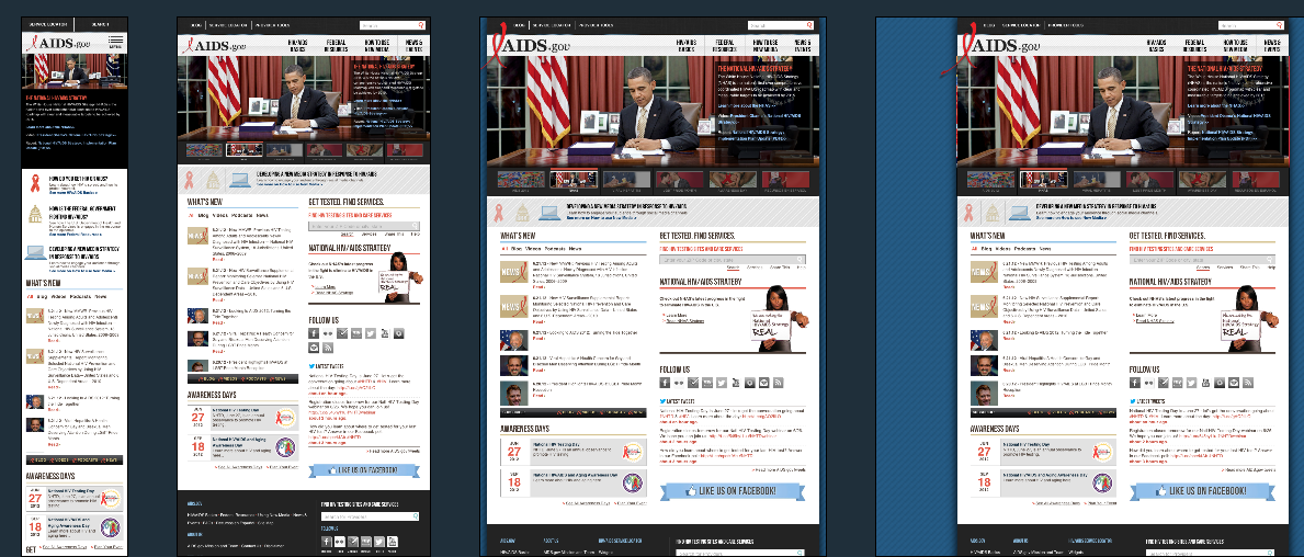
Aids.gov is the first US Government website to tackle responsive web design (not counting www.barackobama.com/ which tecnically isn’t a .gov site).
The website uses Andy Clarkes 320 and up script to provide a linear version of the site for anyone viewing the site sans media query capabilities.
The theory behind this approach is to start with the smallest screen first and build up additional CSS at increasing breakpoints as required. This has become the preferred approach when it comes to responsive design, however you will usually only see it implemented on sites that are redesigned from scratch. If you’re implementing a responsive design on an existing design you will probably work the other way around.
Aids.gov Technical Details
Site Meta Tag
<meta name="viewport" content="width=device-width, target-densitydpi=160dpi, initial-scale=1.0">Media Queries
@media only screen and (min-width: 480px) {

// styles here

}
@media only screen and (min-width: 600px) {

// styles here

}
@media only screen and (min-width: 768px) {

// styles here

}
@media only screen and (min-width: 992px) {

// styles here

}
@media only screen and (min-width: 1008px){

// styles here

}
@media only screen and (min-width: 1382px){

// styles here

}
@media only screen and (-webkit-min-device-pixel-ratio: 1.5), only screen and (-o-min-device-pixel-ratio: 3/2), only screen and (min-device-pixel-ratio: 1.5){}
 A notebook you'll actually carry every day.