Humaans
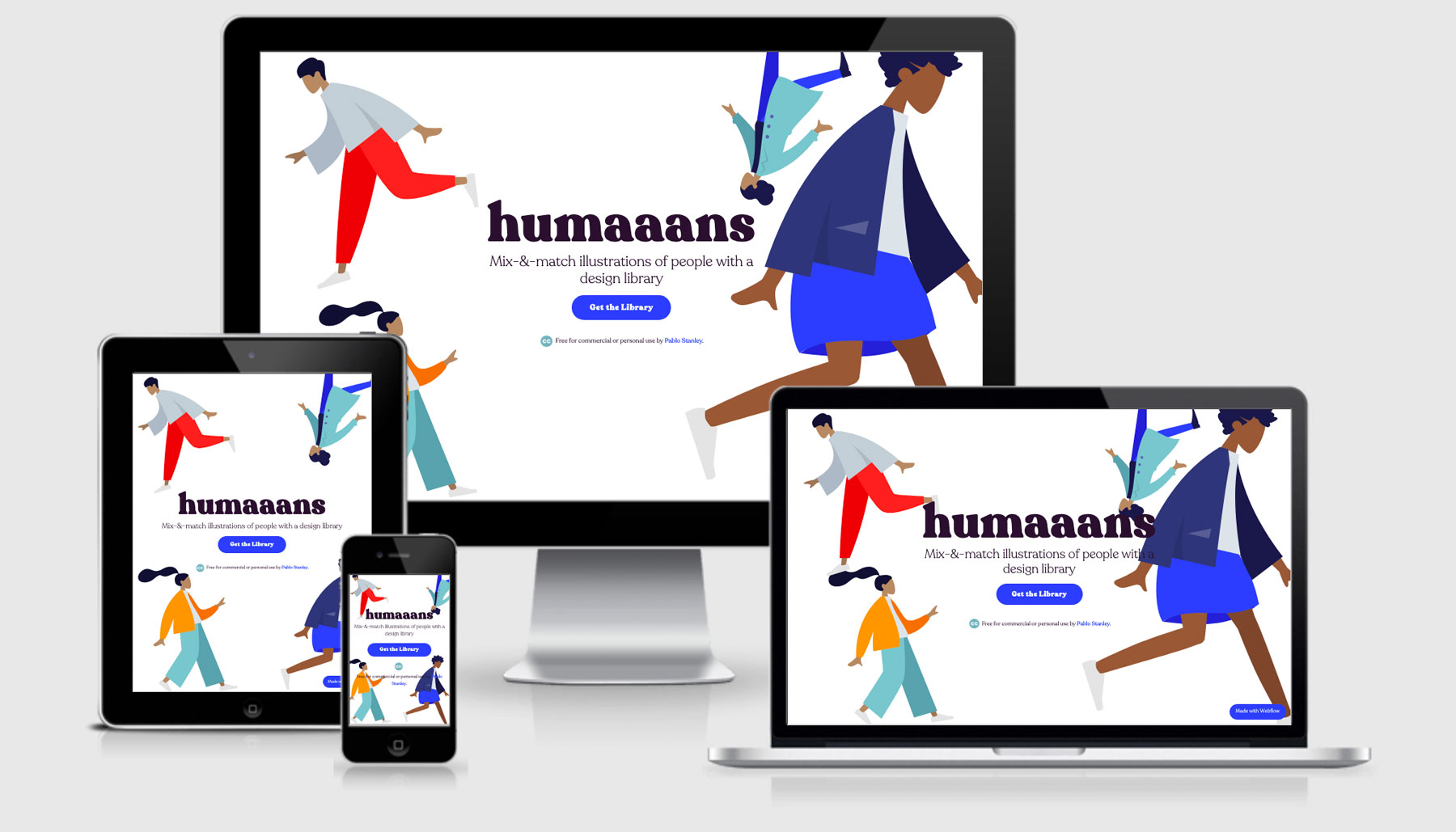
This resource site was built using Webflow and I must say they’ve done a wonderful job. I’ve always been critical of the type of code that comes out the back of website building tools like Wix, SquareSpace, and WebFlow but I’m happy to say this looks pretty semantic.
Javascript
This little snippet of code is looking to see if there device that the user is on has touch capabilities (think smart phones, tablets, new fancy laptops that aren’t macs).
Having touch enabled devices will then add a class name of touch to the document body so that certain features are then included. It would be great if this could be achieve via an @supports media query.
<pre class="language-html"><code>
<script type="text/javascript">
!(function(o, c) {
var n = c.documentElement,
t = " w-mod-";
(n.className += t + "js"),
("ontouchstart" in o ||
(o.DocumentTouch && c instanceof DocumentTouch)) &&
(n.className += t + "touch");
})(window, document);
</script>
</code></pre>CSS
There are some initial styles declared in the <head> as well, but not what I would expect from something like critical CSS would offer.
<pre class="language-css"><code>
 body {
            font-family: Recoleta;
            font-weight: light;
          }
          h1,
          h2,
          h3,
          h4,
          h5 {
            font-family: Recoleta;
            font-weight: black;
            font-style: normal;
          }
</code></pre>
There’s two implementations that I’ve not really come across before which have stood out as interesting.
The first is the display of video for backgrounds…
.w-background-video > video {
  background-size: cover;
  background-position: 50% 50%;
  position: absolute;
  margin: auto;
  width: 100%;
  height: 100%;
  right: -100%;
  bottom: -100%;
  top: -100%;
  left: -100%;
  object-fit: cover;
  z-index: -100;
}
The second interesting approach I found when I was looking to see if WebFlow had moved their layouts from floats to flexbox or CSS Grids. As of yet, they haven’t moved across to CSS Grid but they’ve certainly taken Flex and used it across the site. They are using some Grid stuff though, it’s including grid-column/row-start/end for a layout fix.
It seems to be a clearfix method, but I’ve never seen the grid stuff used in here before.
.w-row:before,
.w-row:after {
  content: " ";
  display: table;
  grid-column-start: 1;
  grid-row-start: 1;
  grid-column-end: 2;
  grid-row-end: 2;
}
Overall the CSS is pretty good, at least in my opinion. My only initial gripe is that most of the media queries are max-width focussed which is more of a desktop first approach, but if it works it works (as long as everyone gets a great experience).
Responsive Images
I shouldn’t be surprised that something as advanced as WebFlow is able to deliver on responsive images, but I have to stay it’s a pleasant surprise.
<img
      src="example-mobile.png"
      srcset="
        example-mobile-p-500.png   500w,
        98f6ce3_example-mobile-p-800.png   800w,
        example-mobile-p-1080.png 1080w,
        example-mobile-p-1600.png 1600w,
        example-mobile-p-2000.png 2000w,
        example-mobile.png        2400w
      "
      sizes="(max-width: 767px) 100vw, 82vw"
      alt=""
      class="carousel-img"
/>
Humaans Technical Details
Site Meta Tag
<meta content="width=device-width, initial-scale=1" name="viewport" />Media Queries
@media screen and (max-width: 991px) { }
@media screen and (max-width: 767px) { }
@media screen and (max-width: 479px) { }
@media (min-width: 768px) { }
 A notebook you'll actually carry every day.


