Evolving Responsive Web Design
After Lyza Danger Gardener and Jason Grigsby had their say on what they see is the definition of Responsive Web Design (or responsive web design) it’s Jeffrey Zeldmans turn.
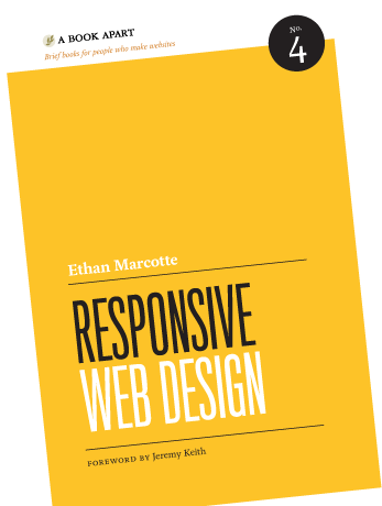
Jeffrey talks speaks of the same argument he had with Ethan back when Marcotte was still writing his book. Although Jeffrey failed to convince Ethan to be more relaxed with the definition, or to just refer to it as web design, he saw this as part of the success of the RWD movement.
By Ethan being so prescribed in his definition and the requirement of those three ingredients of a flexible grid, flexible images and media queries, it allowed us web designers and developers to focus on the building based on those rules rather than arguing and contemplating other approaches.
I’m no genius. What I meant by “bigger idea” was limited to the notion that we’d one day be able to create responsive layouts with different techniques—so let’s not restrict the concept to a particular execution. I wasn’t thinking about other meanings of responsive, wasn’t considering problems of responsive content, and so on. I’m not that forward-thinking and it was three freaking years ago, come on.
An excerpt from Evolving Responsive Web Design
 A notebook you'll actually carry every day.

