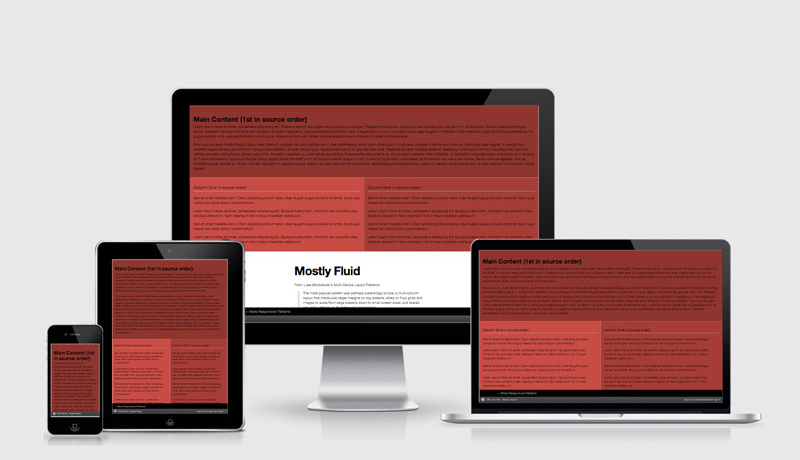
Readable, Fluid Type With Basic CSS Smarts
A lovely tutorial on making the most of your content by paying using EM’s, focussing on line length, hitting the right breakpoints and adding in some column magic.
Keeping your type at comfortably readable line lengths can be quite a challenge with responsive design. When viewports can be nearly any size under the sun, it can feel like we’re going to need a whole lot of media queries and coaxing to keep our type in check. We want our type to be stretchy, but not too stretchy, and we want it to look good across the board.
An excerpt from Readable, Fluid Type With Basic CSS Smarts
 A notebook you'll actually carry every day.

