CSS Round Display Level 1
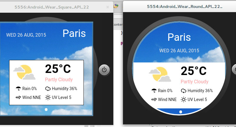
I feel like I’m a million years behind… Alright, so that’s an exaggeration, but I’m certainly a couple of months behind. CSS Round Display tells the web pages how to behave on a non rectangular screen – or like it is literally called – on a round display. Although this specification was developed by a team at LG Electronics for their smart watches, this is precisely the specification we’re going to use to get around (pun intended) the notch on the Iphone X and ensure that all of our websites won’t have white bars down the sides on Landscape mode.

Conventionally, web pages have been shown through a rectangular screen such as PC, tablet, and smart phone. The window content area in a web browser is a rectangle. Each HTML element follows the W3C box model and thus is also a rectangle.
Nowadays, devices come in varied shapes of the displays. It needs to consider the shape of the display when implementing web pages on devices. However, current web standards lack some features to support the devices as follows:An excerpt from CSS Round Display Level 1
- Lack of the capability to detect the shape of a display
- Lack of layout mechanisms suitable for the shape of a display


