Responsive Type and Zoom
 A notebook you'll actually carry every day.
Beware when setting your typography in responsive sites as there are chances that the way you implement it will remove the ability to users to properly zoom in on text when they want to.
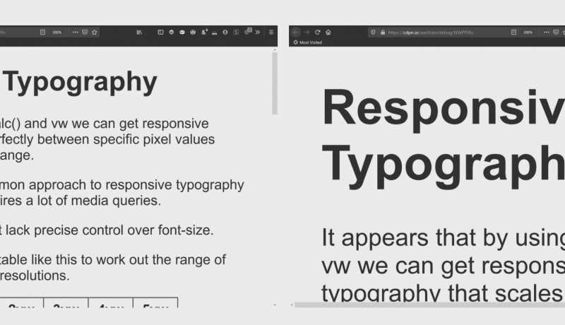
To demonstrate the difference I forked a five-year-old Codepen that had just been updated last week, Precision responsive typography and started zooming the page, capturing screen shots along the way.
Then I duplicated the pen, removing all the responsive sizing styles, ensuring the text started at the same size in an un-zoomed window. Then I zoomed and screen-shat it.
An excerpt from Responsive Type and Zoom

