Three Column Layout
 A notebook you'll actually carry every day.
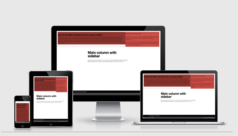
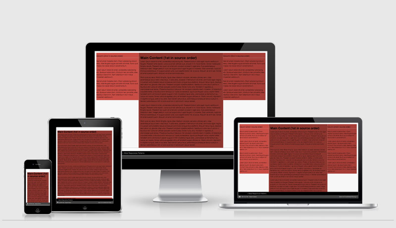
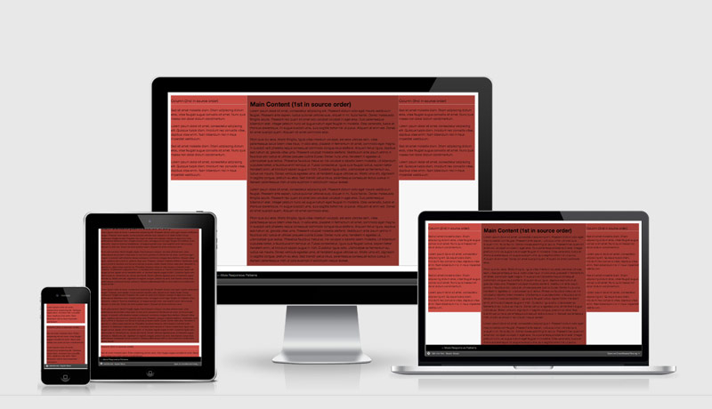
Three Column Responsive Pattern starting as a single column mobile first layout.
To begin with the sidebar columns are stacked under the main content. When enough screen real estate becomes available the sidebars move to the left and right of the main content area.
See the Pen 3 Column Layout by Justin Avery (@justincavery) on CodePen.