RWD Podcast Episode 10: Responsive Typography
Listen to episode
Today I shot out a request for what people wanted me to cover this week and there were some great suggestions.
- Typography in more depth
- CSS Image building in html emails
- Google Glass and Smart Watches
I chose typography. Why you might as?
Fundamentally the web is about information. Although a picture tells 1000 words, the fact is the 1000 words is going to tell a better story in our lives.
Typographic Scale & Ratio

Back in 2011 Tim Brown wrote an article for
more meaningful typograhpy — Tim Brown
Modular Scale — Tim Brown
Font Size – Important size (image), but it could be the size of the heading text when you think it’s just right.
It’s all about the EMs
Set your body font to 16px, font-sizes to EMs.
One EM is equal to your base font size.
Because you’ve created a modular scale, like vectors, it will grow.
If everything is based on Ems, you only need to update your font size in a media query and the remaining font-sizes for all of your elements will scale perfectly.
If you’re setting EM for padding or margins of layout remember this will change too.
14px – 16px for mobile
16px for tablet/desktop
18px for larger screens (because you could be further away from a larger screen)
It depends on your content.
======
Typography Performance
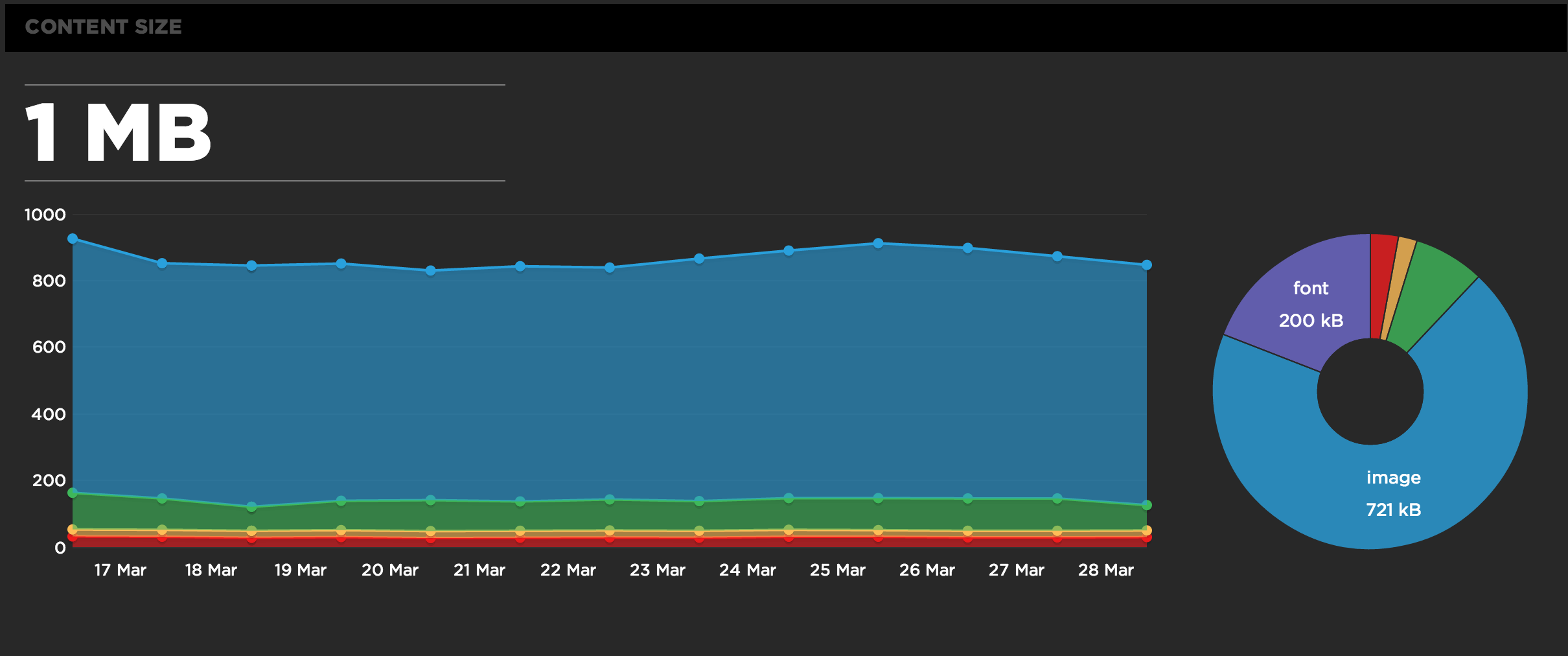
Typography, watch for performance if you’re using custom fonts too.


