RWD Podcast Episode #16: John Allsopp
Listen to episode
When first writing the article, A Dao of Web Design, John realised that the medium of the web was one that would support a wide range of use cases. This was a feature of the web, not a bug.
Although written in 2000 it wasn’t until 2007 and the release of the iPhone that we began to understand what this truly meant.
It still took another 3 years of building sites for people to decide it as wise to invest time and money into something that could provide a single source of content across the now quickly growing list of devices. This is where the timing of Ethan’s article kicked off the whole responsive web movement.
“I think it’s now just web design”
John ran a conference in Australia called Respond. This was less about code examples and “here’s a set of technologies” and rather “here’s a set of problems”.
Responsive email design is one of the problems that was discussed.
Framing what the problems we are facing now that we’ve moved away from the layout. We know how the layout stuff works with fluid grids, fluid media and media queries, now what are the actual issues we’re left with.
Take content for example. Do we show all of it? Some of it? We need to display all content to all users but how does it work across a variety of viewports. We have a set of patterns and technologies that we can use, but it’s more about looking at the problems and how we solve them.
We are only really starting to understand the opportunities that these devices present. Users context in a broad sense, quality of their network, even if they have a network. Are they commuting, are they relaxed, are they walking down the street.
Using accelerometers, gyroscopes, geolocation, light meters, these can all give us a sense as designers what the users is doing right now and how can we respond with our user interface.
When we say mobile first, do we think the mobile context or the mobile device?
We’re not building for browsers, we’re not building for devices, we’re building for users. Less content first, less mobile first, and more user first design.
Read the full transcript
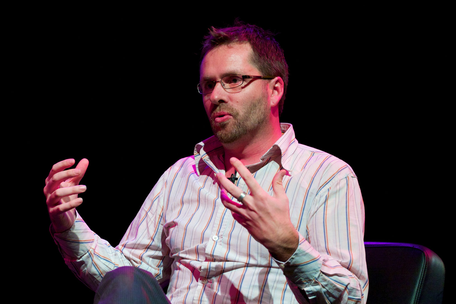
Justin Avery: So hey, everyone. Welcome to another edition of Responsive Design Weekly Podcast. This is episode 16. My name is Justin and I’m the host and curator of the Responsive Design Weekly Newsletter.
This week we have a sponsor, which is Web Directions. Web Directions is an awesome conference in Australia. This year, it is coming up in Sydney on October 30th and 31st. It’s got 24 different speakers. It goes over two days and two streams: product experience design stream, and another engineering code and developer stream – with a couple of keynotes at the beginning and end of each day. Big thanks to Web Directions for being part of the podcast, and we’re actually joined this week by the organizer of Web Directions, Mr. John Allsopp. Welcome John.
John Allsopp Thank you very much, Justin. Yes, that’s one of the many hats I wear, is running those events. Hopefully we can see a few folks along.
Justin Avery: Speaking of wearing many hats, for those that may not have heard of you, do you want to just give a bit of a background on how you got into the industry and where you find yourself these days?
John Allsopp Sure. So, given the history it’s about twenty years long, I’m going to have to compress a little. I started doing web-related things back in the early nineties. We had a software company and we took this crazy idea that we, in fact, would distribute out software online.
That meant we needed to learn about the technology to build websites, and we’re talking about ’94, ’95 time frame and even earlier, for some aspects of it. Just led from there, an interest in the technology, recognition of the importance of things, like CSS, which I started working with before it was standardized; when it was still in things like Internet Explorer 3. And [00:02:00] really, fell as a traditional software engineer, really fell in love, I guess, for want of a better word, with the web as a medium.
I’ve spent a lot of the last 15 years or so thinking about that, what makes the web, the web, what makes it different. What is its real essence? How can we take advantage of it? How can we build things that are uniquely, web native. That’s where I intersect with responsive web design more broadly.
Justin Avery: You also intersected with it before it was responsive web design, as well. Ethan, who coins the phrase, often refers to in his article, which first talks about responsive web design, refers back to yours, back in 2000. How long was that in your mind, in the article that you wrote in 2000? How relevant is it today?
John Allsopp I wrote a thing, some people will be familiar with called “A Dao of Web Design” in April 2000. Not that I’m getting pedantic about that. The funny thing is I’d written it more than once before, just that it used different metaphors. I wrote a thing called, “The Web Isn’t Printed on Paper.” That idea wasn’t unique to me, by any means. This was sort of thing that people interested in CSS and standards-based web and web design beyond our [archona 00:03:34] offshooters of print, were thinking about for quite some time.
We knew the web would eventually end up on mobile devices. There were some early versions of mobile devices that supported the web, to some extent, even then. We knew where this was headed and we already had the challenge, we had different widths and heights of screens. We had 640 by 480, 800 by 600. We had all these debates [00:04:00] about which target we should have. A few of us recognized that some, this wasn’t a common frustrating bug of the web that we had to deal with all these different devices. It was actually a feature. We had been thinking about this for at least two or three years. I guess lots of other people for a lot longer. But it all crystallized in that particular article, which Lister Park very generously published all those years ago.
At the time I thought, this stuff is going to be standard within months. I really never thought there was going to be much longevity, in that, article particular, because I the argument was going to become so standard. For a long time, it just stayed as a theoretical issue, because, the truth is, we didn’t have too much diversity in terms of the screen sizes and characteristics that we were dealing with. If anything, there was a convergence, there was less of a diversity of screen sizes. Despite the fact that there were many different mobile devices that came and went that supported the web from the early 2000s onward, it really was only with the iPhone and genuinely usable mobile web experience that the penny dropped for people.
But it’s interesting that’s still three years until Ethans article in 2010. What I think happened was that even though this device was now in people’s hands. People started to realize we needed to tailor to this mobile web. I think it had to reach a critical mass where decision-makers were willing to invest money, because they place on the opportunities that were missing. Or they saw the business that was going elsewhere, because they want supporting people using mobile devices.
Justin Avery: We’re now fourteen years past your article and four years past Ethan’s article [00:06:00] and short to follow book. We’ve moved from the basics of fluid containers, fluid media and media queries to help fill the screen and whatever viewport that we are arriving and we’re moving to more advanced techniques these days. You organised a conference recently in Australia specifically around responsive design and I think Brad Frost came over for it, as well. What were some of the reason behind organizing that? How did you go about choosing topics? Where are you seeing this next generation of responsible, it’s just web design now, where is this sort of stuff heading?
John Allsopp I’ll start with that observation, I think it’s just web design. Although, the brand is strong and people are still very excited about it. I’m forever getting people telling me about how awesome their team of people with responsive web design is, probably those people not entirely aware of my role, however small, in the emergence of this set of practices.
This year with Responsive Web, we called it Respond and I guess that’s a challenge to people. It’s a call for people to respond to this new environment, up to a point. This year laid the groundwork and it was much less about specific code examples. Interestingly, we end up with a whole lot of people like product managers, even creative directors there, as well as, web designers and developers.
Our goal was less around here’s a set of technology, and more about here is a set of problems. We broke the day into a number of shorter segments where each of them was a relatively short piece about a challenge that people were facing. [00:08:00]
One example might be responsive email design. Email is going away from text. It’s a very strong and viable platform for communication. It ends up on mobile devices probably even more than the websites do in many respects. That’s an example of the sort of thing we were looking at.
It was really about framing what are the problems we are facing. Now that we’ve moved beyond the OE, we can make it adapt to the screen size in a really simplistic way. What is content? What do we do with content? How much of it do we show? Do we show all of it? How do we face the challenge of showing all of it, but in the a way it doesn’t overwhelm a user on a small device?
To my mind, this is the area we increasingly, I think, should be focusing. The implementations, we got the technology, they pretty much work, we have a set patterns that we reasonably well understand. What are the problems these technologies and these patterns can help us solve?
We’ll do Respond again. Our time frame, probably late February in Sydney 2015. That’s really what we’re trying to address with this conference. We want to cover some of the implementation issues, but really it’s more about the problems, that we’re facing now that we’ve moved beyond simply adapting existing desktop oriented content on to smaller screens. I think there’s a lot more to come.
I think we’re really starting to understand the opportunities that these devices present and not just the devices. When we think about a devices, we tend to think of screens. I think more of context in the broad sense. Our users context includes the screens they’re using, but includes a whole range of other aspects: the quality of the network; whether they even have a network; whether [00:10:00] they’re relaxing comfortable; are they commuting; are they walking down the street. It’s a whole range of issues like that that build the context of the user; I think that we can start thinking about and designing for.
Justin Avery: The techniques at the moment around understanding the users’ context, is this something which is lacking from, technical capabilities, as well, make understanding a true context, are they unavailable? Are they off-line? How do we the understand the full breadth of the user’s experience at that particular time?
John Allsopp One of the areas, I’ve spent a lot of time focusing on the last couple years is the whole off-line web world. The reality is, we can create things for almost every modern device and browser that work when the user is not connected.
We can store data locally and synchronize it at the time when the user is connected. We can quite straightforwardly, in many cases, build sites that once the user has visited once, will just load locally off the user’s device. Even if they are not connected, even on a flaky connection, they can continue to use our applications.
To some extent, knowing whether or not a user is on a connection and how good it is, is less of an issue. Although there are some emerging technologies that are supported at a [inaudible 00:11:31] Firefox that allow us to even get a sense of how fast the user’s connection is. That’s one area, but there’s a whole lot of other capabilities that the web is getting access to now in mobile devices and tablets, and so on, using accelerometers, using gyroscopes, using geolocation and even things like light means.
They can all give us a sense, as designers, what are the user’s doing right now. [00:12:00] And how can we adapt a user interface? A really simple example I always come back to, I have a dear relative, who is very competent, very intelligent, older person and still lives a very challenging, interesting life. They just happen to have an essential tremor, which is increasingly common for people as they get older, which it means as they hold the device, it shakes significantly and makes it very hard to use the screen to touch targets and so on. It’s pretty easy to detect, so if someone is shaking like that, the device will shake, it is almost trivial to detect.
I’m not saying that we should run out and all implement a solution without testing it, but I think there are opportunities to acknowledge or recognize that a user is in that context. They’re shaking, it might be because they’ve got a tremor. It might because they are on a plain. Or they’re coming to land. They might be running down the street. In all these contexts, it’s going to be hard for them to hit a target. Maybe we can adapt the target for them? If there’s a really important target for them to hit, we can make it bigger. We can reduce the other things around them that they probably don’t have time or energy to focus on, like copious amounts of small texts, by way of example.
To me these are just giving some hints of what I think are going to be increasingly important questions to think about. It’s not just to rush out and try and solve them, but to think about how we can adapt to situations like that.
Justin Avery: Talking of adapting, I was speaking last week to Jeremy Keith who is huge on progressive enhancement, when you are approaching, we’ll call it web design, from that point of view [00:14:00], not even maybe from a technical point of view, but even just a work flow approach, how do you go about approaching a design problem or creating an interface like this, in a progressive way so that you’re building it, it’s not so much, is it mobile first? Or is it content first? How do you, the work flow, coming up with those decisions?
John Allsopp I think it’s such early days that I’d be very hesitant to even have an answer around that, certainly anything remotely definitive. I think it’s more to my mind these are pointers in the direction, I think, of where we can take designing in terms of responding to context.
When we say mobile first, and I think it’s been really important kind of step. When people say mobile do they think the mobile context or do they think the mobile device. I always go back to this, we’re not building for browsers, we’re not building for devices, we’re building for users, which sounds like a truism, but I think we lose sight of it often. What I call, mobile first, or context first, the more user-first design, we are starting to sound so ridiculous, as we shouldn’t even say it, but that’s what we should be doing.
Thinking about a user and then user apps. What does that mean? What we’ve learned with mobile first or we’ve learned in responsive web design, all of those are part of this. But I think it’s very important to not get caught up all the time with breakpoints, for example, or a particular technique, because they’re means to an end. And the end is creating the best possible experience for our users, and that’s what I say all the time when I teach my off-line workshops and talk about off-line, think of these as ways of creating better experiences for your users.
If we approach new technologies [00:16:00] and new design techniques as precisely that, I think that’s going to be a very good light on the hill. It might not help was with the, well maybe it will help even with the very minute details of design, but I think in terms of the big picture of what we’re doing. If we try to keep in mind that ultimately we are trying to help users solve a problem. If we’re designing for the user, not the device, not the context, but really for that person. I think that’s what we’ve always done, in a way. But I think that’s a very useful, kind of light to lead us.
Justin Avery: Perhaps just stepping away from, as you talk about it, is it going beyond just a standard browser? Is the web just browser based? Or do you see the web as more than that? The things we are building don’t concentrate on just a browser serving that up, it could be just about anything?
John Allsopp Absolutely, I think increasingly there won’t even be screens on a lot of our devices. The idea of a smart device is typically slapping a screen on something, not exclusively, but a lot of the time. Even in wearables and so on. But I think increasingly, many devices won’t have screens, almost by default, they won’t have browsers. That doesn’t mean they won’t effectively be web-enabled devices. You can even think like little hardware things like Tessel, which have java scripting interpreters on them that essentially, web technologies, the native technologies for increasingly many devices and platforms. I think that’s only going to spread further.
You can look back to web OS, Palm’s sadly lamented [00:18:00] experiment I guess would have been the word, of an operating system where web technologies and the web with sort of first-class, native technologies of the platform. Blackberry have done similarly with Blackberry 10. It sounds like a litany of, failed experiments or experiments that have not been as successful as others, but I think these are really early days. Look at Chrome OS. Obviously, Google are continuing to invest heavily in web technologies as core technologies for platforms.
Justin Avery: Hasn’t Firefox just released …
John Allsopp Yeah, Firefox OS, a operating system where web technologies are the native technology. Windows 8 you have a whole API, WinRT which essentially exposes, the underlying operating system, APIs to Java Script to web technologies.
To be quite honest, I think as platforms fragment, we just can’t afford to focus on one or two platforms, on IOS or Android. I think we’re going to see so many platforms where we are going to need a common set of technologies to reach out to all of them. And that’s going to be the web.
To my mind, the browser is the very earliest stage of the penetration of the web into people’s lives. Essentially I don’t think we will have increasingly things that look browsers on a lot of devices. It will be just what you see when you turn on that device, if it has a screen.
Justin Avery: That’s awesome. That’s really interesting.
John Allsopp It sure is, because if you know how to build for these technologies you have an almost unlimited future. We have very challenging times. Imagine being an IOS developer and you got really good at it, you are a god at objective C. And what does Apple do? “Sorry guys [00:20:00] we got a new language for you.” This is not going to happen on the web. Right, we got ES6 ES7, backwards compatibility, is always there on the web. That’s as much a comfort and a security for developers as people who work on that platform, as it is for our users and so on. This is dealing a little bit away from, in some respects, the topic of responsive web design, but I still think it is part and parcel.
Justin Avery: It’s an evolution, really.
John Allsopp Right, exactly. The web is about evolution, sometimes radical evolution, but still evolution nonetheless. Compared to other platforms, which are about radical change between IOS6 and IOS7 and IOS8. You have to look at Marco Arment, for example, who spoke before IOS7 came out, he was celebrating that we are going these new fast, sweeping through the ecosystem and creating new opportunities and he is already with IOS7 and 8 now. More recently, he talked about his concern that how many things have been updated with IOS7. Is this the right approach? I think the web gives us this opportunity. The web gives us these opportunities to build on what we’ve done on the past rather than throw it out and start all over again.
Justin Avery: John, I would love to keep going down this rabbit hole, but I know we are short on time. Is there anywhere which you would recommend the listeners go and check out more information around this, to learn more? Or a conference to attend?
John Allsopp Well, if they happen to be in Australia or want to come out here, we run a whole range of conferences across this whole spectrum. One of the areas that really interests me is what is termed the internet of things, or as I like to call it the internet. There’s some really interesting folks doing a lot of amazing work. We bring a lot of people like that together. I think that’s something, people should really be thinking a lot about. Obviously, they should go to the [00:22:00] Responsive Design Weekly. You have a great set of resources that are very, very helpful to keep across these things, because it can be challenging.
Finding the right people to follow; there’s some good people to follow on Twitter, who will surface the things they find interesting, which you should, as well. In a way, just as the web platforms, browsers, and technologies are somewhat fragmenting now, once upon a time, there were two or three places you would go and you would be up-to-date with everything and now, I think it is much better that it isn’t like that anymore. It is slightly harder to keep across everything, but there’s just so much more happening that’s really good to see new sources of information emerging, new experts, and people who bring a lot of what they’ve learned and share it on the web.
Justin Avery: I’ll grab a couple of the links off you. As a follow up, we’ll post them in the show notes, as well so people can go check those out. John, I’m sorry this is such a short period of time. Thank you very much for joining us. Is there anything else that you would cover before I have to run off?
John Allsopp Let’s do it again soon. Maybe we can talk a bit more about the offline stuff, because I think that’s an area that people aren’t adopting as much as they should. When I speak about it, even with very experienced developers, they’re often really surprised by what is realistically possible now.
I think if people are looking to explore some new things that will really increasingly become important as part of what we do in designing and developing the web. Explore things like application catch and service workers, which is following it on. Things like web storage, local storage, and a range of other things that I think can really aid creating better experiences for your users today and will become increasingly important into the future. [00:24:00]
Justin Avery: Fantastic, well I’ll certainly hold you to that. I look forward to catching up with you for another chat like that. Thanks very much John for joining us and thank you everyone for listening in. We’ll be back again next week.
Thanks John.
