RWD Podcast Episode 44
Listen to episode
Hey, everyone, and welcome to Responsive Design Weekly Podcast, episode number 44. My name is Justin Avery. I am your host and the curator of the Responsive Design Weekly Newsletter, a weekly newsletter all about responsive design. A whole lot of cool stuff has been happening since the last time I ran one of these. This is episode 44. The last 2 episodes were all about the presentation that I gave over in Germany, in Berlin, and since then, there’s just been so much happening, tons, and I just wanted to share a couple of those things with you as well.
This week, we don’t have a sponsor, but what I will shout out is that we’re finally getting the Responsive Design notebooks printed up, so just in time for Christmas. Although, it was supposed to be at the beginning of this year. I’m doing a set of 3 notebooks that you can get a hold of, so the 3 notebooks will be covering the 3 tenants of responsible design or responsive design, so we’ll have our fluid grids, our flexible media, and our media queries as well.
Each of them have 36 pages inside and a little quote in the back from some of the leading thought people, our thought leaders, so there’s a little bit in there from Brad, a little bit in there from Ethan, and also a little bit from the man who I think started this on this path a long time ago which is Mr. John Allsopp with his “Dao of Web Design.” Yeah, so that’s coming up. If you go to backpocket.co, backpocket.C-O, you can put your email address in there and be one of the first to find out when they come available. There’ll be a limited edition of 200 available in the sets, [00:02:00] so be quick, be very quick, and grab it. Yeah, more about that in the weeks to come.
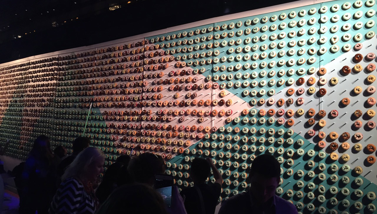
Recently, I was lucky enough. I head over to the States for the Adobe Max Conference. It was a 3-day conference. I was there for a couple days either side. It was just amazing. It was really cool. They put on a huge massive big event. The party that they had there, it had donuts. They had a doughnut wall, which I’ll put a picture up in the show notes. It was crazy. They had some really great keynote speakers, and some of the things that they were sharing about where they’re heading with the products was great. They had some really good product demonstrations.
I think they’re doing … Adobe are actually doing a pretty good. Given where they were for a little while, they’re doing a really good job in listening to what you and I as web designers and web developers, what we need and what we’re missing in our day-to-day workflow like the web is continually changing, so is the way that we’re building, and we need our tools to change along with us as well, and it’s just becoming … I think their focus has been a lot more around collaboration, but they’ve also had some pretty cool stuff improved as well, and there’s a new product coming out, which is a project called “Comet,” which I might talk about in a little bit as well.
Yeah, like all great conferences have … It’s not so much about everything that you see and you’re presented, but it’s about the people as well. This one, the Adobe Conference was no change from that, so there were some amazing people there. I got to actually meet the people from Comet and who are working on it. I might as well talk about it now. [00:04:00] Comet is a new kind of prototyping tool that Adobe are coming out with. It gives you the ability to mock up designs quite quickly and allows you to reuse patterns, so if you have a particular pattern.
Just think we’re doing a … we’re building Pinterest, for example, and we want to mock up how that might look, so you might have card view or you might have a multi-card view. You can build out 1 card, and then option-click and create a second card, but then you can turn that into like a module. As you click and drag the … if you were to make it larger, so wider or taller, instead of it stretching the width of the card itself, what it would do is it will turn into like a repeater, so it will repeat it to the right, and it will repeat it low down as well.
The other cool thing is that we usually design these things with Lorem Ipsum. You can put dummy data in there, so if you type a name into a name field and then something into a description field, it can randomize stuff, so it knows that you’re putting in name, so it will put in random names. If you have a first name and second name, it will put in random first names and second names, so you can get the feel of like, “Is it going to go over 2 lines? How is the design going to look if someone’s name is really, really long?” They even extend it further past that where you can drag … you can have a whole bunch of images sitting in your library, and it will automatically pull those images into the little pins as well, so you can see how real images will look.
The great thing though about that is when you extend it further and you can go … so if we were redesigning Pinterest in this example, we could go to pinterest.com, and we could have a look at a board, and I could … from Comet, I could like … I can’t remember what the command was, but just say it’s like a right-click on the title, and then you go over, so you’ve got a page in your design [00:06:00] full of these cards. Right-click on one of the titles, go to pinterest.com, and select the title of a range of cards in a view as well, and it’s smart enough to look through all the HTML, find out what elements that title is, and then pull back all of the content, and populate your design with the content on the website. If you were redesigning a website, you can redesign it with real data as well, which I thought was super cool, but that’s just like one of the small things.
There’s another guy who I hang out with quite a bit too, Jay [Messing 00:06:38]. He’s over based in Germany. He’s the guy who came up with the Open Device Lab or one of the guys that came up with the Open Device Lab. The whole concept of the Open Device Lab, we want to test on as many devices as possible, right? We build these websites, they’re responsive. We need them to work. We build them, so that they work across a variety of devices, but then most of us, a lot of us will just test inside of Chrome or Safari, and open up DevTools, and move things back and forth, but you really need to get on to devices to check out how they actually feel and how they interact with the site. It doesn’t make sense. Is it comfortable?
Now, buying devices is really, really expensive. Really expensive, so this Open Device Lab allows you to go and look at a world map. You go to opendevicelab.com, and you get to see a world map, and you can see where there are device labs near where you live. You can go to that device lab, and you can book some time, and go in, and test your websites on someone else’s devices. It’s an open device lab. You don’t have to pay for any of these.
Equally, if you’re a company who is fortunate enough to be able to afford all these devices and you want to share that with the community, you’re not using them all the time, then you can register yourself on [00:08:00] Open Device Lab. Register the devices that you have, and then other people can come, and book time with you, and sit down, and test their websites using your devices, so a really, really cool idea.
Who else was there? I caught up with Brad Frost. He was there, and he introduced me to one of his friends , Dan Rose. Dan Rose is … he was a really cool guy. We hung out a bit. We went to the Kings’ hockey game. I’m from Australia, so I don’t actually think what ice hockey is like and about, and so I went in a t-shirt, and it was really cold. I didn’t think that perhaps the stadium needs to be chilly to keep the ice from melting, so I froze for most of the game, but he’s really cool, Dan.
He runs a website called “Photoshop Etiquette,” so photoshopetiquette.com, and you should all go and check that out. If you are a designer and you work in Photoshop, go and check this site out. It tells you how not to be a pain in the butt when you hand your designs to a developer. It gives you tips on how you should be adding layers, how you should set things up, how you might be able to set your workspaces up or your outboards. If you’re a developer, go and check it out. See how the designers will and can lay their Photoshop files out to make your lives a lot easier as well. Yeah, definitely go check it out.
He’s done a lot of really cool work around Photoshop and workflows, wrote a book for Adobe called “Responsive Design with Photoshop.” He does not advise you to design responsively inside Photoshop. You can’t design for every single device and every single break-point unless you’ve got a hell of a lot of time, but the book goes through and explains when [00:10:00] … what you should be doing in Photoshop, and where you should be jumping at, and trying to get in the browser, and get into the code as quickly as possible, so a lot of experience around that sort of area as well.
Now, I’m going to try and get Dan … or Dan, he’s going to come on the podcast in the next few weeks, and we’re going to talk about that. We’re going to talk about a responsive workflow, and he’s going to talk through Photoshop and share his experiences of how he designs and how he works with developers and other designers who have more … so other designers that might have a lot of dev skills like a lot of HTML and CSS skills, and also, how he works with people that have limited dev skills who have never used HTML and how he works with them in different ways as well. He is primarily a Photoshop guy. A designer, but he does have his like responsive badge coding up site, so it should be a really good episode. I’m really looking forward to that as well.
There’s another guy there called “David Blatner” as well, and he’s more of an Illustrator and InDesign guy. He runs a couple of different conferences, and I think even like InDesign magazine or something. I’m not a designer. I’ve never heard of that magazine before, but he was really a nice guy, and we were talking about … because he was into InDesign and stuff like books can be written through InDesign, all these design and laid out type set, and we’re talking about bringing books into the browser to make the content universally available across the world or universally.
It really struck a chord with me like this conversation because I’ve been working on a side project of taking a PDF version of an old book, a science-y book, a universe-based book, and I’m trying to put it across to HTML and CSS to make it more accessible [00:12:00] for everyone to be able to access it. It’s an unsolicited side project, but I’ve really enjoyed working on it. I want to make it offline and available for everyone.
I started doing a bit more research around it and seeing some other books as well, and there’s a whole bunch of really great examples where authors publish books. They’re for sale. You can download the PDF. You can download the EPUB version, but … and they might still be in print as well, so you can get a hard copy, but they also provide all of the content online for free. If you want to find out about it, then you can go and learn about it, but if you want to buy and you want to contribute to them, then you can buy it.
This one is learnpythonthehardway.org. Aaron Gustafson is … just released a second or is in the process of releasing a second edition of the “Adaptive Web Design” book, but if you go to adaptivewebdesign.info, you can either pre-order the second edition, or you can read the entire first edition on the web as well. Brad Frost is writing a book, “Atomic Design in the Open.” As he writes each chapter, it gets added to his site. That’s at atomicdesign.bradfrost.com. Mark Boulton as well, he wrote … Jeez, I can’t remember the name of his book. “The 5 Simple Steps: Web Design.” I’ll put it on the show notes, but that is another one (ed: it was actually Designing for the Web).
Lara Hogan with “Designing for Performance” so designingforperformance.com. Again, there’s a button there to buy it, but otherwise, you can read the whole thing online as well. Also, there was one I was speaking to, a former podcast guest, Stephen Hay. He really gets into this sort of stuff in terms of manipulating Markdown. [00:14:00] He uses a tool called “Dexy” to work with his content, and he mentioned one called “practicaltypography.com.” That’s something that I’m looking at, at the moment, so this concept of writing content in one place like in a Markdown sort of way.
I should point out that people are … that like Aaron, Brad, Lara Hogan, they all used Jekyll, I suppose. Like a static site generator, they created their content in Markdown, and then they ran it through a static site generator, which punched out a website at the end of it, which they then went through and hand-coded all the stuff that they want to, but the whole idea of like writing once and publishing everywhere is like the idea that we have with responsive design as well. We have to have it in 1 centralized location.
Anyway, this “Practical Typography” book is just that. It’s written, and then it’s using a thing called “Pollen” which is able to push it to EPUB. It’s able to push it to PDF. It’s able to push it to .MOBI. It’s able to create a book as well. I’m going to look into that, and try and get something, which we’ll be at a … republish this, this thing. I’m only really concerned about doing the HTML version because the other versions have already been created and are being sold. Yeah, it’s really, really interesting, and that’s the side project that I’ll be working on over the next couple of months anyway, so that’s excellent.
One of the things I’m trying to do is mostly make these, the books, available offline. When I was going to fly over, I wanted to do some work on this side project, and it involves a little bit of jQuery because I’m a little bit terrible with JavaScript. I can get by with jQuery, but I often have to refer to the documentation, and that’s hard to do at 30,000 feet.
Now, [00:16:00] I haven’t used … I didn’t have Dash installed, which is apparently the go-to tool and what I should have, but I went to a site called “devdocs.io,” and that allowed you to save different development documents offline, so when you went back to that URL, all of those docs would be available to you to check out like I had problems with my jQuery I couldn’t work out, and so I went back to devdocs.io on the browser in the plane at 40,000 feet, 50 … whatever. However high you fly. I typed in the URL, and then bam, I had all the information that I needed.
I really love that idea of not just every device, we’re creating content for every device in every scenario, but also, every data connection. If you’re not connected to the network, is your content going to be available anyway? That is something that I think is the next thing that we’re all working towards. The other thing that I’m working towards is like making things more performant. Recently, the last couple weeks anyway, they had the release of AMP, so the Accelerated Mobile Pages. This is the new thing that Google kicked out there, and the whole idea is that it makes things faster.
When love when things are fast and when things load fast, but I had a carpool of problems in understanding what they’re actually trying to do. For one, the A-M-P Project or the AMP Project requires you to create a new template layout for your site. It forces you, and I do mean force, so you to include this. You have to include the AMP JavaScript in the header of the document. If the AMP JavaScript doesn’t load, then your page doesn’t load. For me, that’s against the [00:18:00] natural way that we try and get people to build things like, “You should build them progressively, you should make your content available, and then you should lay things upon it.” To come up with a solution to a faster … to making faster websites and then forcing this JavaScript in there, it goes against the grind a little bit.
The other thing that it requires you to do is you need to use only a subset of HTML elements, and a lot of those elements then get renamed. For instance, if you want to include an image within your AMP document, then you need to not use the image tag. You need to use “AMP-image” as the tag instead, and then there’s a bunch of HTML tags that you are not allowed to use. I can’t recall all of them. I’m going to say things like you can’t include things like iFrames. Basically, they’re trying to make it as performant as possible, so they’re stripping out things that might counteract to that performance.
Now, for me, it … this approach is like going back to an MDOT site. All right? In the past, we used to have desktop sites and mobile sites, and the mobile would have an entirely different structure around it. It would have different content in it, and it would only be available for mobile phones. This feels like the same thing. It feels like I need to create a new document to house new content within that just to take advantage of this AMP process.
Now, you can use … you can do it though like the focus I think shouldn’t be about, “Let’s get on to AMP, and let’s start booting our pages there, and then that will solve our performance problems. Then, we can make our other site really, really big and have loads of images, [00:20:00] and it doesn’t matter.” That’s not the approach like I would focus upon making your site as bleeding fast like bleedingly quick as possible. Once you’ve done that, then you can look at your AMP stuff because effectively, AMP is just a way of making the web faster, so if you just made your website faster, you wouldn’t actually need to use it.
Now, the good thing is it’s not that difficult to set up, so … and complain a little bit about it, but effectively, if you already run an RSS feed, this is essentially what you’re doing. All right? RSS takes the content of your page, and then repurposes it within an XML structure effectively, and then you can customize what you want in there. AMP does the same thing, so I created a new template. I created a new layout for the content area. The CMS that I use has like a template as a wrapper, which would be the header, a HTML head, body tag, and then closing body tag, and closing HTML, and then a layout wrapper, which then just lays out how the page structure would normally look.
For me, it took me an hour to set up. I didn’t include any styles within it because I didn’t want to copy and paste styles, and spend time. It was just to get it going, and I didn’t mock around with the images at all. I included 1 image at the top of the page, which was like the article feature image. Imagine that like as a thumbnail kind of image, so I used the AMP image for that, but otherwise, I didn’t worry about converting image tags within the body of the content itself into AMP image tags, so I don’t know how that’s going to break.
Like I said, it’s like using RSS. If you’ve already got that, it’s not too much of a step. [00:22:00] The only other thing you need to do, you need to put a meta tag in the head of your document, so of the original document on your website. You put in a meta tag, and I think you do a “rel,” a “rel AMP.” I’ll put it in the show notes to relate it, and then you give the URL of the AMP version of the page. Then, on the AMP version of the page, you point back to the canonical version of the article as well, so it’s cool.
Again, I’m not really sure it’s the greatest thing in the world, but for an hour’s work, at least it’s up there. You can check it out. I don’t think I’ve set it up on the podcast page, but if you do go to one of the articles page, if you go to “Articles” in the menu, and then check out one of the articles, then you’ll be able to see the link to the page, and then you’ll be able to grab the link for the AMP page, and then open that up, and check that out as well. How you register it with Google, I just assume they’re going to index my pages, and then find that canonical link, and then go and index the AMP pages, but I’m not actually sure. If anyone does now how that might happen, do let me know.
Google, Google do some cool things. This is one of them. I know they’re trying to make the web faster. One thing that they did to make the web faster was they removed that 300-millisecond tap. If you had a mobile, a touch device on a webpage, it would delay 300 milliseconds on a touch to ensure that it wasn’t going to be like a touch scroll. You put your thumb on the screen, and then you just push it up, and that’s a scrolling action. If every time you did that and you were hovering over a link or a button, you don’t want to fire that, and then just go to a different page every time you’re going to scroll. That would be super frustrating.
The browser vendors put in [00:24:00] this delay to see if you like touched like down and up, and then it would do the link after 300 millisecond. Whereas if you left your finger there and moved it, then it would know it was a scroll event, and then it would scroll the page for you. On any device or any website on a Chrome browser on Android, that has … or the viewpoint meta tag set to width equals device width, then it removes that 300-millisecond delay when clicking and still avoids the incident of accidentally clicking through to links when you’re scrolling as well.
Now, WebKit have just announced that they’re doing the same, which means Safari users like us … yay, or us. I say “us” because I’m an Apple person. We’re going to get that on the iPhones, which is awesome, but one of the problems is it’s been released now, so they say, “Yes, we’re going to do it now,” but the release cycle for Safari is just diabolical. They release it once a year when they release the update to the operating system, so we’re not actually going to get it until like September of 2016. Thank you for that, Apple. You guys rock in the most sarcastic way possible. It is super like frustrating to have this sort of things. This sort of thing is like so close, but then not able to actually take proper advantage of them.
Fortunately though, our great friends at the FT, the Financial Times labs, they’ve come up with a lovely little script which allows you to bypass the whole 300-millisecond delay, so if you go to GitHub … GitHub. Is there a website called “GitHub?” I wonder. If you go to github.com/ftlabs/fastclick, [00:26:00] it will remove that 300-millisecond, 350-millisecond delay from clicks and make your websites just feel so much more responsive. Definitely, go and check that out. It requires JavaScript to work, but hey, so does AMP, so sometimes. If it doesn’t load, then you’re just going to get the same use case, the same experiences as not loading it and you’re not losing out on anything.
Now, that is designed to make it feel faster, make the web feel faster, and when we say “feel faster,” we’re always equating this to, “How does a native feel? Like how much faster does a native app feel?” It feels native. It’s smooth. It’s 60 frames per second. I was having a long conversation/argument with a really good friend of mine on the way home from the football the other day. He is brilliant. He helps me with my hosting. He gets my website running super fast. He’s been a massive help over the last couple of years, but we’re talking about this new app that was coming out and how it didn’t have a mobile side. It was native only.
We know that Instagram went this way for a little while, but I’m sure even from the get-go, Instagram still allowed you to view pages. You just couldn’t do anything, so if I took a picture of something, I could share it with someone. If they didn’t have Instagram, they still got the web version, and they could see the image. Now, I want to say if they didn’t have that maybe at the very beginning, it was a real pain in the butt because someone would send a link or post a link to their Instagram image, and then you’d go there, and it’d be like, “Bop bow, you need to install [00:28:00] Instagram,” and that’s super frustrating like really, really frustrating.
Anyway, so we’re having this chat, and we’re talking about this new app, and it’s only native, and they’re not going web because they don’t feel as though web provides a good enough experience for people and that the web is dead. Now, not his words. He’s recycling the words, but yeah, like the web is dead, and that native apps were the future, and the web will die this death.
Now, I remember seeing a presentation recently where they put up all the wide articles that mentioned that the web was dead all the way from like ’98, ’99, 2001, 2003, 2005, 2007, 2009, 2011 like it just keep coming up, “The web is dead. The web is …” this time, definitely dead that native is going to kill it. Whenever I hear it, I just giggle to myself and like, “Yeah. Okay. Fair enough. The web is going to die. Sure. Native is the future.”
I can see their point. It’s just going … it’s a bad user experience. They want to build their brand on a fast, sleek experience, but I think the experience of clicking and receiving a notification about something, and not being able to access it unless you have a specific phone or a specific operating system, or if you have enough space on your phone to be able to download the app, if you have a good enough connectivity to warrant downloading 50 megs, if you have a good enough connection. Not just like the speed of the connection, but how’s your data plan?
I don’t know how big this app was, but I’m talking about like 50 or 100 meg. That seems a lot to me to be able to just view some content and a few pictures, but you have to download it like you [00:30:00] still have to download it. There are no times ever when you receive something that you have to download the internet. You never have to download the web. All right? Every device comes with a browser. If it doesn’t have a browser, it probably doesn’t connect to the internet, and you probably want to be able to get your native experience on that device as well.
For me, he was like dangling a massive red flag in front of my eyes that’s like waving in front of me just waiting for me to charge, and charge I did. I stuck up for the web, and the way of building things responsively, and also that it doesn’t need to be slow. We have things like this FT click thing. Now, I agree, it will be … things will be sleeker on native because you have … you’re closer. You’re like 1 layer of obstruction, closer to the operating system. You can tap into … just things will work faster that’s naturally. It’s a natural thing.
In the talk that I did at the MOBX Conference, I don’t understand why you would have one over the other, right? I can understand why you would have a website over native apps because it’s universal and not everyone is going to download the native app, but I don’t understand why you have a native app without a website. There’s no reasoning around it. You’re just cutting off your nose despite your face by saying, “This has to be special. Only special people can access this particular content. I don’t really want to access the universal audience that I have at my fingertips if I had a web version of this.”
Anyway, we spoke lots about it. We argued quite a bit, and then we [00:32:00] just bowed and agreed to disagree. It turns out that on further conversations, and when we looked into it a little bit further, and spoke to a few other people we know, it is on this company’s roadmap, and they are heading in that direction now, whether it was always that plan or they come to the realization, but it’s something which I totally agree. Native apps are great. You do need them for some things to be super fast like I use Slack. It’s great. I have it on my tablet and my phone, but I also have it in the browser. All right? It’s just a good experience. If I were only able to access it in the browser, I would be absolutely fine with that because it does what I need.
That’s my week. That’s what’s been happening. Yeah, we’re going to … I’m putting a couple of these links that I’ve talked about so far into the newsletter this week. If you’re not subscribed to the newsletter, make sure you head over to responsivedesignweekly.com and drop your email address in there. You’ll get a newsletter once a week talking about all this kind of stuff with links that you can go off and check things out yourself.
Next week, we’re going to be talking to … I say “we.” I’m going to be talking to the team from ZURB. ZURB are the guys that build Foundation. It’s like Foundation and Bootstrap have been going head to head for the last couple of years. ZURB are actually about to release Foundation Version 6, and they’ve cut their code by 50%.
They’ve made things faster. They’ve made them smarter.
What we’ll be doing is we’ll be catching up with some of the developers who have been putting this stuff together and talking about why they changed it, what has changed on the web for them to warrant changing the [00:34:00] framework in this way. Also, if you are running something like Foundation, how people be able to go and do updates properly. Can they just drop it in there, or is there like a few steps that they need to go? Also, where they’re looking at next like what they think the next big problem is to squish out.
I also mentioned we’re going to be talking to Dan Rose. It’s coming up, so that’s going to be all about workflow, and working with Photoshop, and the responsive design workflow in teams which will be really cool and really interesting. Then, also, Rachel Andrew who has agreed and said she’d be happy to come on the show as well. Rachel is going to be talking about her thoughts and knowledge on the grid layout specification, which is really exciting. It’s bed down a little bit now. It doesn’t change as much as it was, so she’s been able to create some really awesome examples and build up a little bit of a talk around. I think in the moment, she’s in the States talking at an event, but … so it will be really good to get her on and chat through that stuff as well.
Yes, we’ve got some really great guests and talking about some really great topics on the way over the next couple of weeks. Yeah. Thank you for tuning in and listening. Please go ahead and rate the show up 5 stars. Leave a comment. That’s how people find out about it. Tell your friends. Tell your friends to subscribe. If you have a topic that you want me to cover, or if you would like to join me and talk about some of the things that you’ve been doing at work, or some of the things that you’ve been working on, or some of your own thoughts and ideas, then do reach out. You can reach me the contact form link in the footer, but until next week, stay responsive, and I will see you then. Cheers, everyone. Bye.
