Fluid Baseline Grid

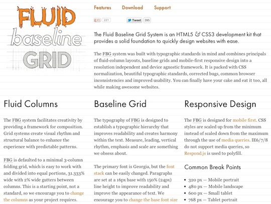
The FBG system was built with typographic standards in mind and combines principals of fluid-column layouts, baseline grids and mobile-first responsive design into a resolution independent and device agnostic framework. It is packed with CSS normalization, beautiful typographic standards, corrected bugs, common browser inconsistencies and improved usability. You can finally have your cake and eat it too, all while making awesome websites.
Fluid Columns
The FBG system facilitates creativity by providing a framework for composition. Grid systems create visual rhythm and structural balance to enhance the experience with predictable patterns.
FBG is defaulted to a minimal 3-column folding grid, which is easy to work with and divided into equal portions, 31.333% wide with 2% wide gutters between columns. This is a starting point, not a standard, so we encourage you to change the columns as your project requires.
Baseline Grid
The typography of FBG is designed to establish a typographic hierarchy that improves readability and creates harmony within the text. Measure, leading, vertical rhythm, emphasis and scale are something we obsess about.
The primary font is Georgia, but the font stack can be easily changed. Paragraphs are set at a 16px base with 150% (24px) line height to improve readability and improve the appearance of text. We encourage you to change the base font size and line height to suit your needs.
Responsive Design
The FBG is designed for mobile first. CSS styles are scaled up from the minimum instead of scaled down from the maximum through the use of media queries. IE6/7/8 do not support media queries, so Respond.js is used to polyfill.
Common Break Points
- 320 px — Mobile portrait
- 480 px — Mobile landscape
- 600 px — Small tablet
- 768 px — Tablet portrait
- 1024 px — Tablet landscape/Netbook
- 1280 px & greater — Desktop
 A notebook you'll actually carry every day.


