ish

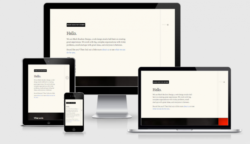
Ish. is another viewport tester in the large realm of viewport testers.
I like to this this one is slightly different though because it’s made by a pretty cool and very intelligent guy, Brad Frost.
The real reasons for this tool is to educate and to facilitate a mental shift. Many clients, designers and developers get hung up on specific device widths, which is why this tool doesn’t include any such language, device chrome or anything like that. Ish. helps keep everyone focused on making a design that looks and functions great at any resolution.
The tool allows you to preview your responsive design against small medium and large viewports that are not tied to specific devices, and is much a tool for testing as one to try and break us away from focussing on specific device widths and focus on what looks best for that size.
Another great thing about .ish is the randomiser feature. It will randomly update the viewport of the page so that you can easily test how your site might appear for those in-between major breakpoints (minor breakpoints or tweak points).
This is something that will work directly from Brads site, but it is recommended that you install and run it from your own server.
 A notebook you'll actually carry every day.


