Responsive Measures
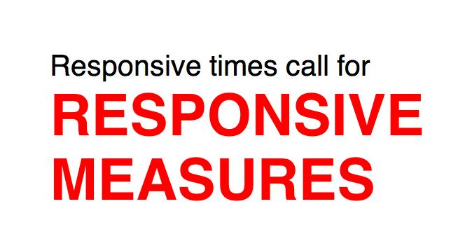
Reading is one of the most basic things we do on the web. CSS gives us control over font-size and line-height but we don’t have a good way to control the measure. Until now.
Responsive Measure is a simple script that allows you to pass in a selector (ideally the container where your primary content will go) which generates the ideal font size needed to produce the ideal measure for your text.
The example codepen utilises one of the layouts described by Ethan Marcotte in an A List Apart article.
See the Pen Responsive Measures by Justin Avery (@justincavery) on CodePen.
 A notebook you'll actually carry every day.