Adding webp images progressively
 A notebook you'll actually carry every day.
WebP is one of the latest image formats to arrive on the web and it has a lot of things going for it. It provides better compression and introduces transparency without the additional bloat that you get from PNG24. It typically manages 30% more compression than JPG without any loss of image quality (see study)
Generating WebP
The process of generating WebP images is a little difficult at the moment. The easiest way to test out the webp format is to upload an existing image the Convert to Webp site.
Telegraphic provides a plugin for Adobe Photoshop to allow you to incorporate it into your image generation workflow however I found it difficult to get up and running on the Mac version of PS. The main issue I had was that you need XCODE installed…
which on hotel/conference wifi is not an option.
Webp and responsive design
The biggest complaints about our websites these days is the size and performance, and images are often the biggest culprits when it comes to these size issues. Webp provides a better compression, which means smaller images and faster load times.
With the introduction of the <picture> element we now have the capability to provide not only multiple Art Directed images, but also multiple image formats. The browser will then choose the most appropriate image format to render and voila… you have a picture.
<picture> and WebP
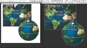
If you’re looking to include webp as part of your site then here’s the way you can do so in a progressively enhanced way. I’m using an unsolicited side project as a way to test this out, and here’s the results side by side on Chrome and Safari.

As you can see Chrome show’s the transparent version of the image, while Firefox renders the jpg version of the image.
The markup for this approach is below.
First we declare the <picture> element, followed by two different <source> elements.
Within the <source> we declare a series of images in the srcset in the same way that we would do in the <img and srcset approach. We can also include an optional image typ
  <picture>
    <source type="image/webp"
            srcset="images/worlds-300.webp 300w,
                    images/worlds-600.webp 600w,
                    images/worlds-800.webp 800w,
                    images/worlds.webp 1000w"
             />
    <source srcset="images/worlds-300.jpg 300w,
                    images/worlds-600.jpg 600w,
                    images/worlds-800.jpg 800w,
                    images/worlds.jpg 1000w"
            />
    <img src="images/worlds-300.jpg"
    alt="The Speed of Light and the Timing of Eclipses" />
  </picture>
Support for WebP
Current support as pulled from the Google Developers website is:
- WebP lossy support
- Google Chrome (desktop) 17+
- Google Chrome for Android version 25+
- Opera 11.10+
- Native web browser, Android 4.0+ (ICS)
- WebP lossy, lossless & alpha support (libwebp v0.2.0)
- Google Chrome (desktop) 23+
- Google Chrome for Android version 25+
- Google Chrome for iOS version 29+
- Opera 12.10+
- Native web browser, Android 4.2+ (JB-MR1)
You can check out the latest information for Webp support on Can I Use.
