CSS3 Multiple Columns and Responsive Design
 A notebook you'll actually carry every day.
Yesterday I came across a question on StackOverflow regarding CSS Multiple Columns and Responsive Design.
I’m working on a site that uses a responsive layout and I’ve run into a problem getting around the shortcomings of the newer CSS multi-column properties (http://dev.w3.org/csswg/css3-multicol/).
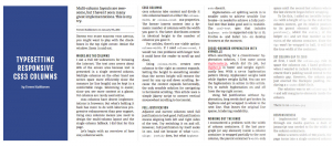
When the browser window is wide enough, I split the text into two columns with an sidebar for smaller images. The multi-column css properties work great, but they’re not too smart.
The first section is split evenly into two equal-height columns, but they’re way too tall. For someone to read this section they’d have to scroll down along the first column, then back up to the start of the next to read the rest.
The second section is split into two equal-height columns too, but there’s only two sentences, so it looks awkward; there’s not really enough content to justify a second column the user has to read across.
EDIT – After finishing off this article I came across a tweet from @tommikaikkonen with an awesome implementation of exactly what the guy was looking for, go check it out – http://kaikkonendesign.fi/typesetting-responsive-css3-columns/
In my answer I decided to add a code pen to show the exact process, and then went on to explain how I came about to the solution.
It uses jquery to check the count of the number of characters inside the content div.
var $div = $( '#blah' ); if($div.text().length >= 600) { $div.addClass('columns'); }If the number of characters are equal to or greater than 600 then it adds the class of ‘columns’ to the containing div.
Just to be clear, this means that any article less than 600 characters will not have the “column” class applied and anything that has more or equal to 600 characters will not.
Now that we’ve got the DOM sorted, on to the CSS (please note that this codepen has some styles that do not relate to this answer, so please use only as a guide).
The next stage is to add the columns for the content that is longer than the 600 characters, but we still need to ensure that on smaller widths we only have a single column otherwise it would just look peculiar.
@media screen and (min-width:48em) {
.columns {
-webkit-column-count: 2; /* Saf3, Chrome*/
-webkit-column-gap: 4%; /* Saf3, Chrome*/
-moz-column-count: 2; /* FF3.5+ */
-moz-column-gap: 4%; /* FF3.5+ */
column-count: 2; /* Opera 11+*/
column-gap: 4%; /* Opera 11+*/
}
}
Here I’ve chosen 48ems and greater (ipad portrait and up) as the point at which the columns are defined, allowing for any smaller screens to be a single column.
One of the issues I picked up later on was that if the text was too long they wanted it to be in a single column again. In this case you will need to either remove the class for a higher value, or put a check to see if the character count is in between the two values.
The Technique
I included a few points for this type of technique the question was looking at.
- I didn’t actually realise from the picture that they were two separate sections until I read the question the third time. Most people would assume that the content in the left column continued to the bottom of the page before moving to the right column (ala newspapers and magazines). You would need some kind of break between each section to show this.
- This is a design thing, so I would assume it would mainly be used for landing/instructional pages where you would want to put more work into styling the content. With that in mind you should just tailor it by adding the classes manually.
- Finally, the web is not print and people are find with reading things on a single page, check out how nice “The Great Discontent” is to read


