A notebook you'll actually carry every day.
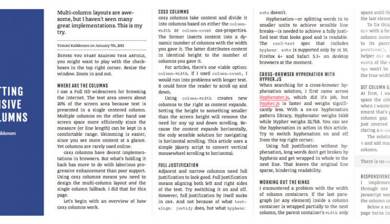
Multiple columns are a great way to make better use of your content canvas area, especially for the breakpoints at the larger viewports.
Working on a mobile first approach to responsive design you will often define the layout of the content in a linear format and then, as you add in additional breakpoints for the larger viewports, you can simply add in the multiple columns as shown in the example below.
The CSS
Here we’re defining that the first paragraph should be bold to give it that introductionary feel. The absence of any column declarations means that aside from the font-weight the paragraph will flow normally.
#example p:first-of-type {font-weight:600;}In this media query we are saying that between the 600 and 900 pixel view port we still want the first paragraph to be in the single column, but the other paragraph should be in two columns with a 4% gap between the columns.
@media all and (min-width: 900px) {
#example p:first-of-type  {
  -webkit-column-count: 2;
  -webkit-column-gap: 3%; /* Saf3, Chrome*/
  -moz-column-count: 2;
  -moz-column-gap: 3%; /* FF3.5+ */
  column-count: 2;
  column-gap: 3%; /* Opera 11+*/
  }
   #example p  {
  -webkit-column-count: 3;
  -webkit-column-gap: 1%; /* Saf3, Chrome*/
  -moz-column-count: 3;
  -moz-column-gap: 1%; /* FF3.5+ */
  column-count: 3;
  column-gap: 1%; /* Opera 11+*/
  }
}
The HTML
<h2>Multiple Column Example</h2>
<p>Well, the way ..... </p>
<p>My money's in that.....</p>