Responsive Review: Starbucks
 A notebook you'll actually carry every day.
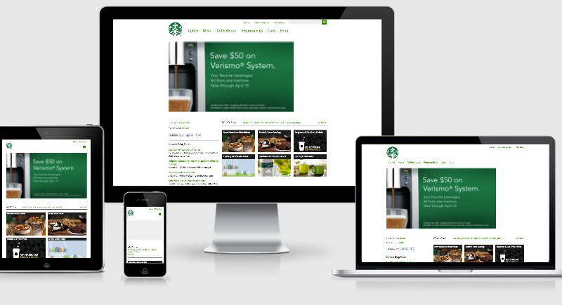
Startbucks was one of the first big retailers to tackle responsive design.
The redesign focusses strongly on white space and provides a very light feel. The first thing that I noticed with the site was the first break point comes along at 769px (assumably designed for the portrait iPad orientation) however the main site navigation begins to wrap onto two lines way back at the 950px mark.
Given the size of the team working on this and Starbucks budget we’re going to assume that this was a deliberate decision to wrap two navigation elements before switching to a new navigation layout.