Hey everyone and welcome to Responsive Design Weekly #397.This week our feature site is amazing. They provide a series of vector humans that you use and manipulate to make a variety of different images… personal or commercial. It’s all done in vector as well so you can export as SVG and be super responsive. Hoorah!Right, let’s get linking!
Sponsor
Get Creative and Improve Your Personal Branding With a Free .design Domain Name.
Maybe you already have a website name but want it to be more reflective of what you do as a designer. Or maybe you’ve come up with a great idea for a website name, only to find that it’s already taken. Either way, here’s your chance to claim a free website domain name that reflects what you do as a designer and helps showcase your work.
Article
The WebAIM Million Update
In August 2019, WebAIM conducted a re-analysis of the accessibility of the home pages for the top 1,000,000 web sites. Let’s see the results…
Toward Responsive Elements
In this piece Brian Kardell talks about the “Container Queries” problem, tries to shine some light on some misconceptions, and tell you about the state of things.
UX: What happens when the user wants out?
This is one of my biggest frustrations when using digital products. How do I exit a process? How to I cancel my membership? How do I unsubscribe? How do I get a payout from your system?
Each of these questions, if unanswered, ensures that the users details/money remains the property of the service. Now from a service point of view this is GREAT, but for the user and their soon-to-be word of mouth it’s pretty crappy.
Tutorial
Responsive Type and Zoom
Making in changes to the font size for each breakpoint is one way to be responsive, but it means that there’s large jumps between them. I prefer the approach mentioned in the comments here, but you should be aware that not all responsive solutions work when users zoom.
Same HTML, Different CSS
This tutorial from Ahmed reminds me of the ol’ CSS Zen Garden. Here he takes a header component and codes it in HTML in the most semantic way possible. Then, using only CSS, makes a series of different headers that you might expect to have seen over the past 10 years…. Of course, as these little projects go, things didn’t always go to plan.
Tools and Resources
Run your own newsletter engine – Mailcoach
This is something that I came across this week which made me pause and think about the investment I have with Mailchimp. Based on this lists size, and sending 48 newsletters a year they say I’d save $14,383 by not using Mailchimp. These figures are based on a pay-as-you-go approach which is not what I do, but they estimate $237 per year as opposed to the $197 I pay per month. I love Mailchimp though and it would take a bit more convincing and investigations to move away… but it is something worth looking at if you’re looking to do newsletters.
Check links in your Markdown documents
If you do a lot of writing in Mark Down and want to make sure the links you’re including are going somewhere other than a dead-end then this npm script might be of assistance.
Page Speed Benchmarks
This week I came across another feature of PageSpeed that I wasn’t aware of, their Benchmarks page. This provides an overview of a range of popular sites across a number of different industries and show’s how they performance against each other (across the US or Europe, and on a fast or slow connection).
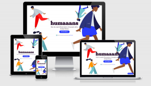
Humaaans: Mix-&-Match illustration library
Mix-&-match illustrations of people with a design library. These are all free to use for personal and commercial and come in SVG so you can chop and change things to your hearts desire. This is also our website of the week.
Finally
That’s all for this week. As always thank you to those that sent through link recommendations, if you’ve come across something or have written something please send it through.
Cheers,Justin.

 A notebook you'll actually carry every day.