Hello and welcome to RWD Weekly edition #399.
One more edition, and we’ll hit the 400 mark! All very exciting. But, that is next week and this is this week and it’s a bumper edition. We’ve got a tonne of tutorials to keep you busy on a Friday and some wonderful tools and resources that I’m sure will come handy in your next couple of website builds.
Let’s get linking.
Sponsor
Pixel Pioneers Bristol 2020 (12 June)
The affordable community conference for front-end developers and UX/UI designers returns to Bristol! This time speakers include Charlie Gerard, Paul Boag, and Val Head, and topics range from machine learning to conversion optimisation. Val will also run a full-day workshop on practical web animation techniques.
Get 15% off standard tickets with the code ‘RWD’!
Article
What Does A Foldable Web Actually Mean?
Foldable devices have brought with them talk of a ‘foldable web,’ and the idea that long-standing web conventions may be on the verge of a serious shakeup. Is it all hype, or is it time to get flexible?
Let’s Say You Were Going to Write a Blog Post About Dark Mode
So this isn’t actually a blog post about Dark Mode. Instead, Chris maps out the steps you should probably take whenever you’re undertaking a blog post to explain something technical. Don’t fret if this is too much though, I’m always a fan of just getting something up and posted over keeping something in draft forever.
How to Edit
While we’re on the writing and publishing path…. this article talks through an approach on what to do once you’re written something. Don’t publish (like I said before), but instead just be glad you wrote it and come back a few days later armed and ready to make it even better.
W3C awards Website Redesign Project to Studio 24
If any site required a redesign, the W3C is right up there. Although accessible (I’m sure), the W3C site looks like it hasn’t had a facelift since the W3C started. Now Studio 24 have been given the honour (and great challenge) to redesign the site over the next 10 months. They’ve got some great case studies and it’s obvious why there were successful in their bid.
Web Content Accessibility Guidelines (WCAG) 2.2 in Development
The WCAG Guidelines is moving forward to 2.2 and the first public draft has been posted. From what I can gather there is only one update to the 2.1 which is a new success criteria for Focus Visible (enhanced) — making an object with focus have a visible focus ring. I’m sure more things will be updated while it remains in draft. The reason behind these guidelines is improving accessibility guidance for three major groups: users with cognitive or learning disabilities, users with low vision, and users with disabilities on mobile devices.
Tutorial
Responsive Grid Magazine Layout in Just 20 Lines of CSS
A really clever approach using a combination of Grid layout and nth-child declarations produces this lovely looking responsive magazine layout.
Introducing the Page Visibility API
The Page Visibility API is useful for detecting the visibility state of the page. We can listen to the visibilitychange event and then get the visibility state with document.visibilityState and so what we want with it. How can you use it? Well imagine you’re playing a video and then scroll away from it, or maybe it was part of a tabbed interface on the page. Well, this would trigger a new visibility state on the <video> element and you can pause the video for example.
Fixed Headers and Jump Links?
Have you ever clicked on an anchored link only to lose the anchored heading because it’s obscured by a fixed header? Super annoying. Well did you know you can use scroll-margin-top to offset where the page lands you so you can still see your anchor heading? Pretty sweet!
Performant front-end architecture
A step by step tutorial that shows you a variety of techniques to make the front-end of your site feel faster.
CSS Motion Path: The end of GSAP?
I’m going to say a very strong NO, it won’t be the end of GSAP. CSS Motion Path provides more reasons and opportunities to rely on CSS and the browser to do the heavy lifting.
Making images lazy load with Chrome DevTools
Some of you might already be aware that you can add loading=”lazy” as an attribute to images and iframes to provide native lazy loading. While this video tutorial covers that, I found the approach to how it was done in the browser most interesting. Using the Overrides capability in Chrome Dev tools you are able to make updates to the HTML, CSS, and JS and then refresh the page and see the updates as if you did it on the server. Marvellous!
How does the Virtual DOM work?
If you’re anything like me you will have heard the term “Virtual DOM” mentioned in a million different tutorials and articles. I’ve never really taken the time to properly understand what it is though, or why it even exists in the first place. Sarah takes us on a journey to explain just those concepts.
Removing people from complex backgrounds in real time using TensorFlow.js
Tools and Resources
mosquito-js
Do you hate your users? If so then this might be the plugin for you. Built by Tim Holman this bit of JS will play an annoying mosquito sound using the web audio api. It’ll have your users desperately closing down all their tabs in search of the noise. What I love most about this is the off button makes a satisfying “thwack” noise as you symbolically squish the mozzie.
Kasaya
Kasaya is kind of like Selenium (it runs Selenium under the hood) but allows someone to write human-like instructions to run tests inside of the browser. You can package these up into scripts as well, something which is quite nice to get started with standardised testing of your sites without having to know huge amounts of coding (you still need to install it though so some dev knowledge may be required… at least to copy and paste).
Tailwind UI
Fully responsive HTML components, designed and developed by Adam Wathan and Steve Schoger.
Monzo – Tone of Voice
Monzo copped a bit of a beating this week with their hiring process for designers. While I agree that the process seemed too much, I appreciate the fact that they’re super clear on what the candidates should expect from the process. If you don’t agree, you just won’t apply. I think this shines through in their tone of voice guide as well, explain things in detail and in plain language for everyone to understand.
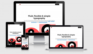
Fluiditype
This small CSS library serves to avoid the responsive web by focusing on pure fluidity in which the system communicates what size to be rendered. Recommend to be used for blogs, portfolios, documentation & and simplistic text websites.
Open Peeps
A couple of weeks ago we featured Humaaans as a resource for Creative Comms illustrations that allowed you to depict a number of different people and change their hair, colour, body, clothes as well as land them on some different backgrounds. This week, Pablo Stanley has come back for more with another set of illustrations called Open Peeps. Same kind of deal, but this has a different illustration style and I feel represents people a little more than the Humaaaans more abstract illustration style. Both wonderful resources, this one you can pay for via Gum Road or download for free (if you can afford it, please make sure you part with a bit of cash by way of saying thank you).
DesignValley
Here’s a whole bunch of design tools that can help you with your web design, from photos to icons, from typography to wire-framing and more this has got something for everyone.
Try Kirby for Free
Discover how Kirby helps you build any type of website. Explore our online demo or download the kits to get started.
Codepen of the Week
Typographic grid layouts
These are some beautiful typographic layouts from Michelle Barker. There’s a bit of scroll snapping with CSS and IntersectionObserver JS to kick off the fade in for the content. Gorgeous.
 A notebook you'll actually carry every day.