Hey everyone and welcome to week #385 of the responsive design weekly.
This week we’re back to seeing the web die…. there are some great video tutorials for you this week plus a few new offline tools. Gymnasium have also published a couple more shorts for us with CSS grid prototyping in the browser, and using auto animate in XD for some sweet transitions.
Right, let’s get linking!
Headline
“The web platform, this beautiful thing that we build sites and apps on, is alive and thriving.”Chris Ferdinandi
The web is not dying
The web has been on and off its deathbed for the past 25 years and each year someone/thing gets traction around the end of times and the cometh of native. There are some serious issues, don’t get me wrong, but with people like Chris Ferdinandi and you at the helm to steer us in the right direction we won’t see the web die any time soon.
Sponsorship
Learn a New Skill in 5 Minutes with Gymnasium
Take 5 minutes to learn a practical skill with Gymnasium’s Take 5 video tutorials. Gymnasium is dropping a new video every day this month with a different theme each week — from web design to career development. What are you waiting for? Start learning!
Article
Getting your sites ready for the new Microsoft Edge
Windows had a release candidate out to go with their fancy new logo (does anyone else get reminded of the Firefox logo?)
A new Edge means they’re finally rolling out the changes which essentially make Edge the same as Chrome. I wish they would have stuck with their own rendering engine and helped provide some competition to Google and the Chromium browser, but what we have now essentially is a different UI over the top of Chrome with some different features switched on and off by default.
That sounds familiar though right? Remember that every browser on iPhone is safari with a different UI and less features.
Become a Front-End Master in 2020 With These 10 Project Ideas
there are some really great suggestions here from Chris. The “find a dribbble shot and recreate it in a clean semantic accessible way” is one of my tasks for next year.
Things We Can’t (Yet) Do In CSS
Yes, that’s right. Even though some folks can create amazing artwork with CSS, like oil paintings, there are still things we can not do. The thing I want most from this article is the Page Regions option… allowing text to flow from section to section of a page layout.
What do you wish CSS could do?
Exploring New Ways To Manage Content In WordPress
After many many complaints about Gutenberg editor within WordPress the future is starting to look a lot brighter. I think they still have a number of accessibility issues to look at for editors that will continue to use the product, but if they put half as much energy into that process as they are to grow Gutenberg’s capabilities they should be in a better place.
Adobe XD Update: November 2019
This was the first time I’ve missed Adobe Max for a few years but I managed to catch up on the announcement videos. While XD has a pretty constant release schedule, it had some big splash announcements last week. The key ones for me are the introductions of component state design, co-editing, and the improved import/export for Sketch.
JavaScript isn’t always available and it’s not the user’s fault
This week in the JavaScript course we’re working on .fetch()ing content via an API call and displaying the contents on the page. My approach was very driven from starting with a more-or-less working webpage and then filling in the gaps with other data, but other more JS centric solutions started with <div id=”app”></div> and worked up from there. In this article Adam looks at the most common reasons why JS might not load on your page and it’s not because users switch JS off.
A conversation between me and the JavaScript programming language
I love the light heartedness of this post, but also the fact that it hits WAY too close to home.
Tutorial
CSS Variables With Inline Styles
An interesting approach in using inline CSS variables to control the layout of your page. I think this is most practical for quick prototyping rather than something you would build out in production, but I love the idea
Some Things You Oughta Know When Working with Viewport Units
I had this exact issue last week while building out a mobile AR experience. The idea was that a full screen popup appeared and I mistakenly used 100vw and 100vh to set the width and height and wondered why I couldn’t see all my content. I’m happy to say the solution I found is what Chris has done in this tutorial, so yay for me actually knowing the right CSS to use for a change.
Videos
Do This to Improve Image Loading on Your Website
Now, this won’t actually fix the performance/slow loading issues you have on your site from the giant unoptimised images you have on the site — there’s another tutorial about that. Instead, Firefox is fixing the problem of moving content as your images load. Add width & height attributes to all your images, and see load jankiness disappear. Jen Simmons explains how.
Scroll Snap in CSS Instead of JavaScript
Marketing pages love a good scroll hijack with javascript. If done well, it’s a great experience, but often when you hijack the scroll it can feel janky and unnatural. Using CSS for this instead still puts the control with the OS and browser when you need it, but also allows you to snap to the bits you need for your marketing :D. In this video from Miriam you get to see just how that works.
New CSS for Styling Underlines on the Web
Finally in 2019, we have new CSS that allows us a lot of powerful ways to style underlines. Jen Simmons walks you through the options.
Tools & Resources
Jotter
Jotter is a helpful little notepad that’ll save your notes offline, automatically for you as you type. A lovely little project from Andy Bell.
Blot
A blogging platform with no interface
Cody House Framework
Kick-start your web projects with CodyHouse’s front-end framework and library of accessible HTML, CSS, JavaScript components.
Heroku Pinger
Keep your free Heroku dynos awake while you are working on them and saves the wait time to spin it up every time you want to test it.
Finally
That’s all for this week. As always thank you to those that sent through link recommendations, if you’ve come across something or have written something please send it through.
See you again next Friday.
Cheers,
Justin.
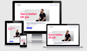
 A notebook you'll actually carry every day.