RWD Weekly #437
 A notebook you'll actually carry every day.
Hey everyone and welcome to week #437 of the responsive design newsletter.
This week we look at Cloudflares new offering for WordPress sites to improve performance, how we should look at things as a front end developer, and there are some great resources and tools to help you along with your next project.
Let’s get to those links!
Sponsor
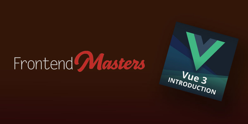
Vue 3 Introduction with Sarah Drasner.
Get started quickly with the Vue.js JavaScript framework. You’ll learn how to build reusable components and make them flexible with props, lifecycles, and slots. Use directives to build functionality with markup and learn to make your own custom directives. And learn what’s new in Vue 3 and how to abstract functionality with the new Composition API!
Article
Improving Performance and Search Rankings with Cloudflare for Fun and Profit
Although CloudFlare have been making sites faster for years, they seem to be taking more steps towards broadening their reach to include SEO benefits (which is page speed as well) and they also look to be adding an analytics platform in as well. Given that quite a few sites are using CloudFlare, it makes sense for them to track more of the traffic after all it certainly helps Google via Google Analytics.
Thinking Like a Front-end Developer
Ahmad breaks down how you should approach the working up a design by starting with ignoring the details.
Avoiding tab styles for navigation
Adam works on the Gov UK team and has recently been working on tabbed navigation (that aren’t really tabs). An unshocking discovery ensued that things that are styled to look like other things but behave differently is confusing. Adam looks at some solutions to the problem.
Importance of Wireframing
While wire framing is invaluable, I always believe that you need your content up front before you begin any kind of layout. The first time a design will fail is when it meets the content.
Responsive Snakes! And what they can teach you about CSS 🐍
The responsive snake, does your design squish, curve, or slice?
Tutorials
A Dynamically-Sized Sticky Sidebar with HTML and CSS
I’ve literally come across this exact same issue today, except the pattern we’re using is a little more like the pattern you see on https://diversity.fb.com/initiatives/at-facebook/. I’ll also be looking at implementing this sticky approach on the cart element on the Back Pocket Notebooks site as well.
Back to Basics: Creating a clickable card interface in plain HTML, CSS and JavaScript
Card layouts are a very common way to display content, but what happens when the whole card should be clickable along with an option to dismiss the card, and maybe an inline link too?
5 CSS pseudo-elements you never knew existed
Well I wasn’t aware of two of these pseudo elements, and I’m going to give them a try out now.
Resources & Tools
Free quality illustrations customised to your branding
One new high-quality, open-source illustration each day. Use our color-picker to adapt the illustrations to your brand identity!
CSS clip-path Editor
A series of predefined shapes to allow your to create clipping paths for your designs along with the ability to customise the shapes.
WebPShop
This week l’ve been working on a site with a cut-out image of people in the banners across the whole site, and seeing as transparent PNG’s with photo’s are HUGE we are using WebP. It took me a while to get the workflow right, but this plugin for photoshop has been really helpful.
Remake – A web app framework for makers
Meet Remake, an open source framework for making web apps with just HTML and CSS.
Finally
That’s all for this week. If you’ve come across any interesting/helpful articles or you’ve written something yourself please hit reply and let me know about them.
See you all next week!
Have a great weekend!
Cheers,
Justin.