Secondary navigation in responsive design
 A notebook you'll actually carry every day.
I’ve previously written about how the design approach for this site was designing responsively desktop first. In that article we talk in detail about the best approach for designers being what they are most comfortable with, however it can lead to a few implementation issues down the road.
In this case we had a great desktop design with a single, two and three column layout depending on the content that you were looking at. The single column was the home page, two columns was reserved for this article section and the three columns were for our site reviews and resources sections.
A little background before we go on. I had originally wanted to include secondary navigation on the left hand side partly because that’s how I had envisioned the IA and partly because I wanted to show techniques for including that pattern within a responsive site. I find that a lot of the big sites
that are content rich and go past a 3 level Information Architecture all have the left hand navigation (sometimes multiple levels) and it’s not always straight forward what you should do with it on smaller devices.

Secondary Navigation Options
So lets take a look at your options for including a secondary navigation within your responsive design, before we take a look at how we implemented our own.
Hide
This is the most ILadvised method of all, but a method none the less.
Include in main menu
The secondary navigation is a natural extension of your primary navigation, after all it will only appear once you’ve landed onto one of the primary menu pages. To make it easier to jump directly to one of your internal pages you could the full IA as part of the main menu.
This implementation is best used when the site is already using a drop down main menu, otherwise it could be confusing for users to be able to access the menu through the mobile viewport but not on desktop version.
After Content
The secondary navigation by definition is secondary content and in a linear version of your site it makes sense to include secondary information after your primary content.
RWD.is secondary navigation
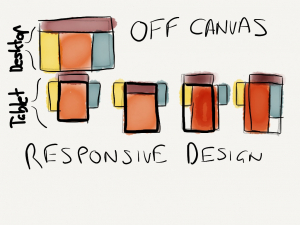
For this site I decided to run with the off canvas implementation for the secondary content for a few reasons
- It was most often tertiary to the main content
- When it was a higher priority it became part of the primary content (landing pages)
- More specific related content was already included below the primary content (related articles, related resources)
To achieve this I mimic’d theZurb Foundation Off Canvaspatterns.
The HTML
The HTML for the content areas of this site are made up from the following,
<div class="content">
   <div class="sub-navigation">
      <!-- Sub Navigation here -->
   </div>
   <article class="article">
      <!-- Primary Content here -->
   </article>
   <div class="related-lists">
      <section class="related-content">
            <!-- Related Content here -->
      </section>
      <section class="related-content">
            <!-- Related Content here -->
      </section>
      <section class="related-content">
            <!-- Related Content here -->
      </section>
   </div>
</div>
The CSS
On the largest devices I maintained three columns until everything started to bunch up too much. At that point, just below the 1024px mark I think, I moved the .related-lists below the content by increasing the width to 100% and letting the document flow take care of the rest.
Once the content reached around the 47em width I wanted the content to be the full focus which was where the off canvas layout came into play. The example below is the off canvas as a default approach and changing the layout once the screen is a minimum of 47em.
.content {
   overflow: hidden;
}
.sub-navigation {
   float: left;
   margin-left: -100%;
   z-index:2;
   position: relative;
}
.article {
   margin-left: 0;
   float: right;
   z-index: 1;
   position: relative;
   padding: 0 2%;
   width: 100%;
}

@media (min-width:47em){
   .sub-navigation {
      float: left;
      width: 23.6607142857%;
      margin-right: 1.78571%;
   }
   .article {
      margin-right: 1.7857142857%;
      width: 57.5892857143%;
      float: left;
   }
   .mobile-nav {
      display:none;
   }
}
@media (min-width: 0em) and (max-width:47em){
   .mobile-nav {
      display:block;
   }
That took care of the .sub-navigation and pushed it off canvas to the left, but now of course there was no way of displaying that content. I should point out that this is super best practice because I’m hiding something by default and relying on javascript to bring it back into view. I took this into consideration and decided to flag this and come back to it post launch because
- Everyone that visits this site is likely to have js enabled
- The content isn’t
display:none;and can still be read by screen readers - It was better to launch and fix retrospectively than delay
What I should do, and will do, is add no-js to the tag and test with modernizr, and then add .no-js .sub-navigation {// other styles} to show the content if javascript has been disabled.
Okay so now we know what should happen lets look at how we can show that.
The Javascript
Because we want to make two changes to the CSS, push the .article out of the way and let the .sub-navigation come into full view, the best way is to add another style to a parent element and use a selector to target the styles.Initially I applied this to the .content
but I thought that there were some other areas that I might want to target later on so decided to apply it to the <body> instead. As you saw in the CSS I was hiding and showing .mobile-nav , this is the button that will appear when the navigation disappears from view.
<div class="mobile-nav">
<a class="toggle-subnav" href="#"><span class="nav-bar clearfix"><span aria-hidden="true" data-icon=""></span>Subnav</span></a> <a class="toggle-menu" href="#"><span class="nav-bar clearfix"><span aria-hidden="true" data-icon="☰"></span>Menu</span></a> The jQuery is fairly straight forward (I left some foundation naming conventions as way of attribution). You declare the $subnav as the button that should trigger the action, in this case a.toggle-subnav and set to toggle class to subnav-active to the <body> element.
var $subnav = $('a.toggle-subnav');
events = 'click.fndtn';
if ($subnav.length > 0) { $('a.toggle-subnav').on(events, function (e) { e.preventDefault();
$('body').toggleClass('subnav-active'); }); }
Now that clicking on the button now adds/removes the class of .subnav-active to the <body> we need to add the CSS that targets those elements
BRINGING IT TOGETHER
.subnav-active .sub-navigation { margin-left: 0; } .subnav-active .article { margin-right: -80%; }
