Jason Weaver

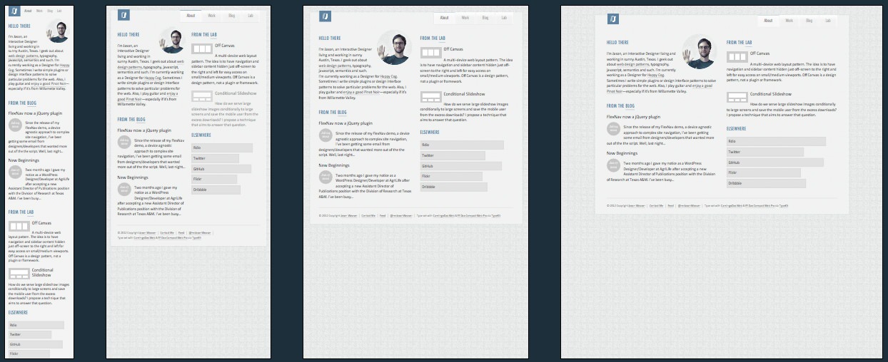
Jason Weaver has a very simple responsive blog. The reason behind including it within our list isn’t so much about the brilliant things he’s doing on the site itself, but the Labs section where he has managed to develop so nice responsive patterns that you can use.
The best of these I think is the off canvas demo. This simple implementation positions the navigation and additional content off to the left and right of the screen respectively on the mobile viewport, and hides the additional content only on
a tablet device (see diagrams below).


All of this is accomplished with minimum fuss as well as you can see below.
The Javascript
var showSidebar = function() {

    $('body').removeClass("active-nav").toggleClass("active-sidebar");

    $('.menu-button').removeClass("active-button");

	$('.sidebar-button').toggleClass("active-button");

}

var showMenu = function() {

	$('body').removeClass("active-sidebar").toggleClass("active-nav");

	$('.sidebar-button').removeClass("active-button");

	$('.menu-button').toggleClass("active-button");

}

// add/remove classes everytime the window resize event fires

jQuery(window).resize(function(){

	var off_canvas_nav_display = $('.off-canvas-navigation').css('display');

	var menu_button_display = $('.menu-button').css('display');

	if (off_canvas_nav_display === 'block') {

		$("body").removeClass("three-column").addClass("small-screen");

	}

	if (off_canvas_nav_display === 'none') {

		$("body").removeClass("active-sidebar active-nav small-screen")

			.addClass("three-column");

	}

});

jQuery(document).ready(function($) {

		// Toggle for nav menu

		$('.menu-button').click(function(e) {

			e.preventDefault();

			showMenu();

		});

		// Toggle for sidebar

		$('.sidebar-button').click(function(e) {

			e.preventDefault();

			showSidebar();

		});

});
Jason Weaver Technical Details
Site Meta Tag
<meta name="viewport" content="width=device-width,initial-scale=1">Media Queries
@media only screen and (min-width: 46em) {}
/* Mediaqueries for the off canvas demo... */
@media all and (min-width: 600px) {}

@media all and (min-width: 800px) {}
 A notebook you'll actually carry every day.

