Andersson Wise
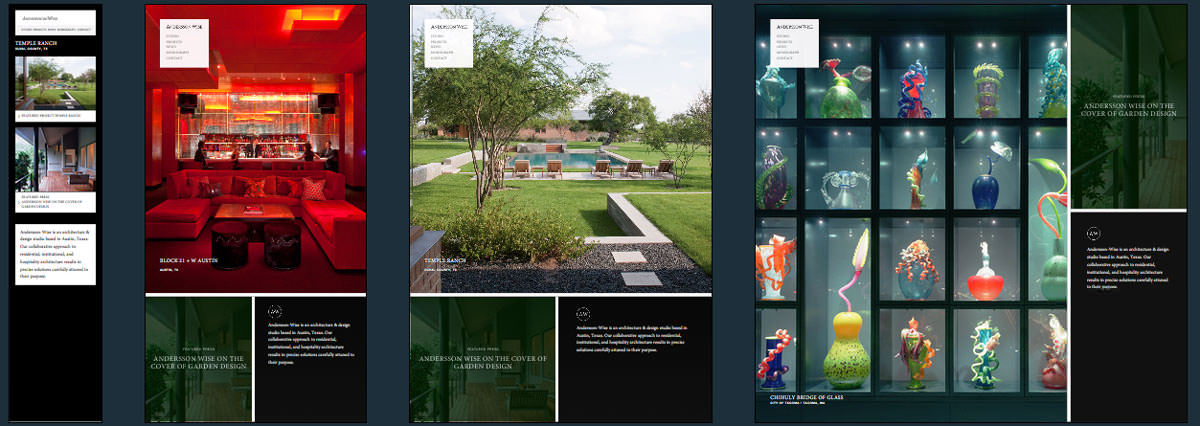
A high quality very visual site, Andersson Wise shows off the works in their portfolio using Backstretch. They’re also being smart about loading on the smaller devices. Only at a large resolution do you get the 1500px images loading, and once you get to the smaller devices the backstretch plugin is done away with and you’re left with a linear layout of images.
We’ve been unable to identify the responsive image technique used here, so we’re interested to find out if you know what it is.
Andersson Wise Technical Details
Site Meta Tag
<meta name="viewport" id="viewport" content="width=device-width, initial-scale=1.0, maximum-scale=1.0">Media Queries
@media all and (orientation:portrait)

@media all and (orientation:portrait) and (min-height:1000px)

@media all and (orientation:landscape) and (min-height:800px)

@media all and (orientation:portrait) and (max-height:750px)

@media screen and (max-width:600px)

@media print
 A notebook you'll actually carry every day.