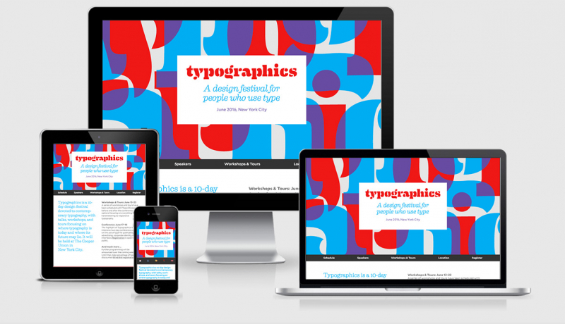
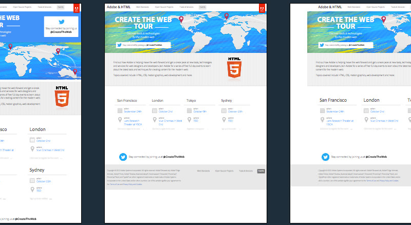
Bedfordshire, University of

View Bedfordshire, University of
Bedfordshire University is a very resource heavy site when it comes to responsive design. One hundred and twelve https requests including:
- 6 CSS files
- 23 Javascript files
- 80 image requests
- 2 font requests
They’ve also included a fallback for older versions of IE
<script type="text/javascript">
jQuery(document).ready(function(){
    jQuery(window).bind("resize", resizeWindow);
    function resizeWindow(e){
        var newWindowWidth = jQuery(window).width();

if(newWindowWidth < 960){
   $("link#ie_responsive").attr({href : "http://www.beds.ac.uk/_designs/beds/css/responsive-design/ie900home.css"});
}

else if(newWindowWidth > 960){
   $("link#ie_responsive").attr({href : "http://www.beds.ac.uk/_designs/beds/css/home_main.css"});
}

if(newWindowWidth < 716){
   $("link#ie_responsive").attr({href : "http://www.beds.ac.uk/_designs/beds/css/responsive-design/ie700home.css"});
}
if(newWindowWidth < 596){
   $("link#ie_responsive").attr({href : "http://www.beds.ac.uk/_designs/beds/css/responsive-design/ie500home.css"});
}

    }
});
</script>
Sadly there is no use of any frameworks or JS resources on the site, not even modernizr or any responisve image polyfills.
Bedfordshire, University of Technical Details
Site Meta Tag
<meta name="viewport" content="width=device-width" />Media Queries
/* iPads (portrait) ----------- */

@media only screen

and (min-device-width : 768px)

and (max-device-width : 1024px)

and (orientation : portrait) {}
/* iPhone (portrait and landscape) ----------- */

@media only screen

and (min-device-width : 320px)

and (max-device-width : 480px) {}
/*handles gap between desktop and responsive design*/

@media only screen and (max-width:985px) {}
@media only screen and (max-width:960px) {}
@media only screen and (max-width:798px) {}
@media only screen and (max-width:765px) {}
@media only screen and (max-width:762px) {}
@media only screen and (max-width:715px) {}
@media only screen and (max-width:595px) {}
 A notebook you'll actually carry every day.

