Create the Web Adobe

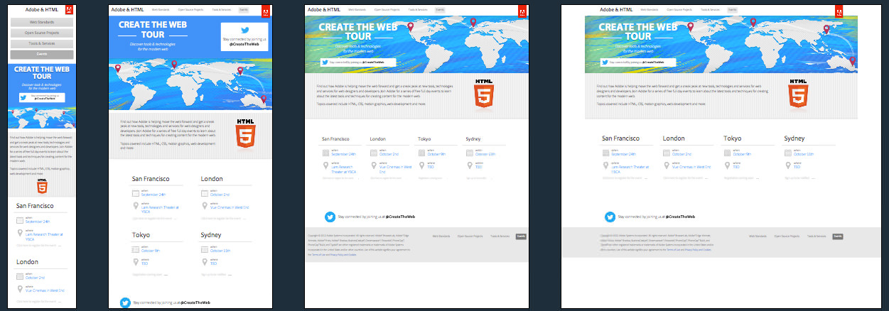
They do get a little bit lazy for their responsive image technique and just hide some from view (even though they are still downloaded)
<img class="landscape" src="/_/img/events/tablet-landscape2.png"/> <img class="portrait" src="/_/img/events/tablet-portrait2.png"/> <img class="mobile" src="/_/img/events/mobile2.png"/>Adobe look to have used the 1140 CSS Grid and based the design on a desktop first layout (setting max-width for the media queries rather than the min-width we see for mobile first designs)
Create the Web Adobe Technical Details
Site Meta Tag
<meta name="viewport" content="width=device-width, user-scalable=no, maximum-scale = 1.0">Media Queries
@media screen and (-webkit-min-device-pixel-ratio:0) { }

@media screen and (max-width:1255px) { }

@media screen and (max-width:920px) { }

@media screen and (max-width:877px) { }

@media screen and (max-width: 825px) { }

@media screen and (max-width:768px) { }

@media screen and (max-width:630px) { }

@media screen and (max-width:620px) { }

@media screen and (max-width:576px) { }

@media screen and (max-width:480px) { }

@media screen and (max-width:320px) { }
 A notebook you'll actually carry every day.
