Offscreen Magazine
This is a wonderful site and an even better magazine. If there’s one magazine you want to keep you company off the screen then do yourself a favour and subscribe to this one, you will not be disappointed.
The viewport declaration is a little more rigid than we would like to see. Setting the initial scale to 1 is normal but setting the user-scalable to 0 means that users on mobile are unable to double tap to zoom in on the content. Technically the user-scalable definition should be yes or no, but it
is still effective. Using the site on the mobile however the font size is set beautifully so there shouldn’t be any reason to zoom (but again we shouldn’t remove the option from the user).
Atop the CSS file is a series of @viewport declarations as seen below
@-webkit-viewport{width:device-width;zoom:1.0}
@-moz-viewport{width:device-width;zoom:1.0}
@-ms-viewport{width:device-width;zoom:1.0}
@-o-viewport{width:device-width;zoom:1.0}
@viewport{width:device-width;zoom:1.0}
The purpose of the
@viewport
declaration is to standardise and replace Apple’s own popular
<meta name="viewport">
implementation. Currently the support is low according to Can I Use with IE, Chrome and Opera only supporting it behind prefixes or flags. The viewport declaration in the CSS is certainly something that makes more sense (keep all the visual rules inside CSS) so I can see this being more broadly supported very soon (except of course Safari perhaps).
Strangely the base font size on the
<body>
element is set to font-size: 93%; rather that 100%, but I think this goes to show the care in which Kai takes with his typesetting to make it absolutely perfect and this is well reflected in the magazines themselves.
The site uses http://adam.co/lab/jquery/customselect/ to customise the look of the select inputs on the form. This unobtrusivley wraps the select input with a span that maintains the native behaviour of the select field but gives you all the stylying options you might need.
Magnific Popup is used for the for Like and Follow link the the header navigation, this is one of the more preferred popups used for responsive design.
Retina.js is being used for the retina versions of the images, which could now be replaced with the srcset 2x and 3x approach to responsive images.
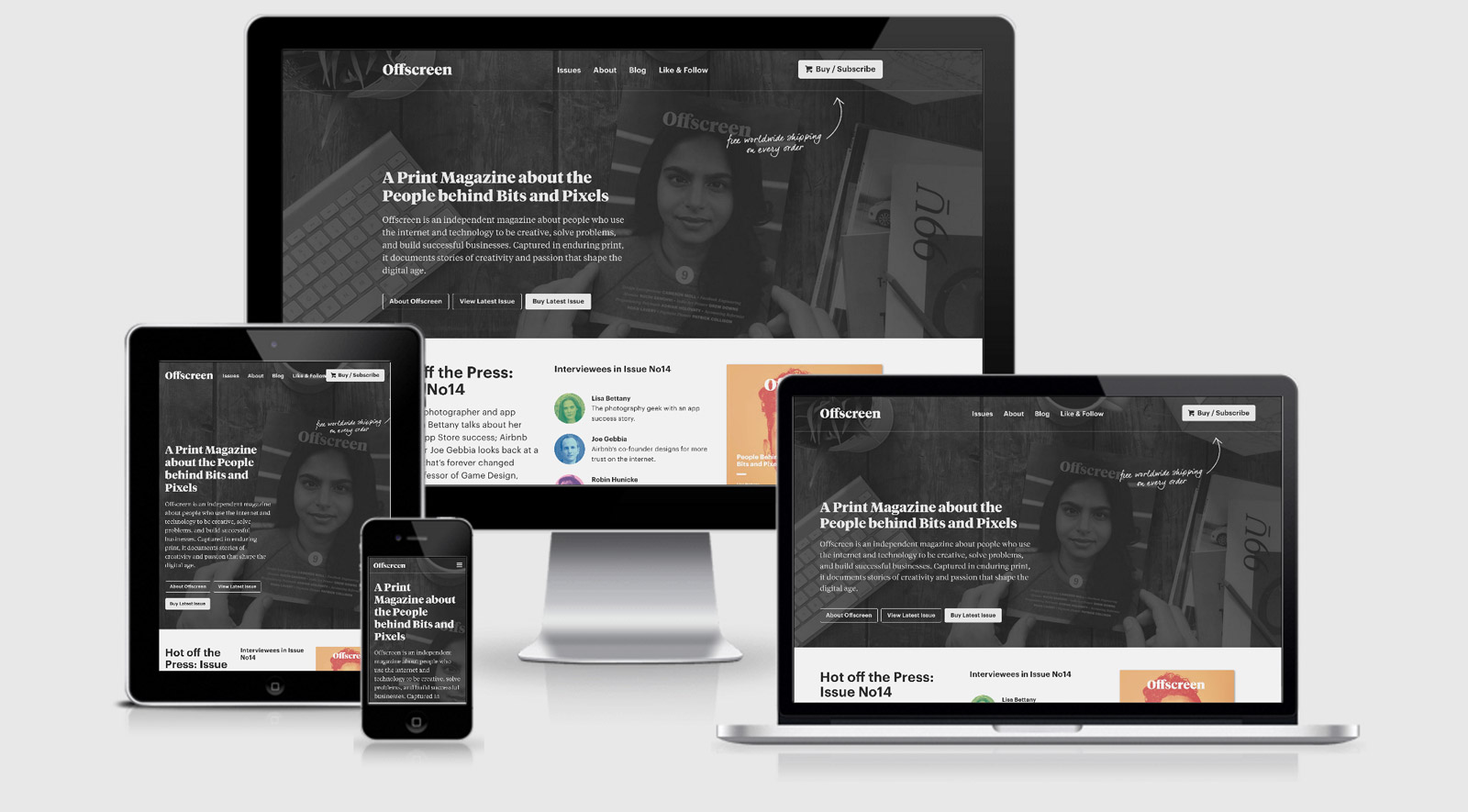
While we’re on images the site weighs in at 1.6MB with 1.3MB of that being attributed towards imagery. Usually I would be against such a high percentage but this site is all about selling a magazine that is only available offscreen so I think in this case the choice is well justified. I would look at the usage of the SuperSlides Plugin though for which around 690kb of images are used across 4 image slides, however it is only shown on desktop but still downloaded on mobile. As SuperSlides appears to no longer be maintained I’d recommend checking out Owl Carousel and including both the responsive and lazy load implementation.
From a performance point of view there are a few images and the custom fonts that have no expirations. This means that they may need to be requested on each visit to the site. A quick update to a .htaccess file or server configuration should see this fixed “fairly” quickly — here’s the go-to .htaccess file from HTML5 Boilerplate. The images themselves could also save a further 400kb through compression by something like ImageOptim.
Offscreen Magazine Technical Details
Site Meta Tag
<meta name="viewport" content="width=device-width, initial-scale=1.0, user-scalable=0">Media Queries
@-webkit-viewport{width:device-width;zoom:1.0}@-moz-viewport{width:device-width;zoom:1.0}@-ms-viewport{width:device-width;zoom:1.0}@-o-viewport{width:device-width;zoom:1.0}@viewport{width:device-width;zoom:1.0}
@media (min-width: 20em) { }
@media (min-width: 30em) { }
@media (min-width: 40em) { }
@media screen and (max-width: 800px) and (orientation: landscape), screen and (max-height: 300px) { }
@media all and (max-width: 900px) { }
@media (max-width: 40em) { }
@media (max-width: 60em) { }
@media (max-width: 80em) { }
@media (max-width: 94em) { }
@media (max-width: 60em) { }
 A notebook you'll actually carry every day.