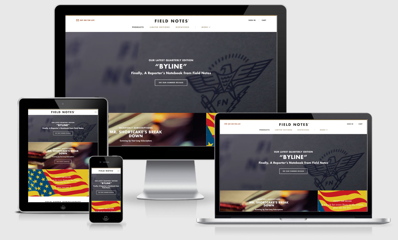
Field Notes

The first thing I noticed when I looked at the brand new Field Notes site, or at least in the source code, was the cool little ASCII art notebook.
<!--

     ;;;;;;;;;;;::;;:;:;;;;;,
     ;;;;;;;:;;;;;;;;;;;;;;;;;
     ;;;;;;;:;;;;;;;;;;;;;;;;;
     ;;;;;;;:;;;;;;;;;;;;;;;;;
     ;;;;;;:;F;I;E;L;D;;;;;;;;
     ;;;;;;N:;O;;T;;E;;S;;;;;;
     ;;;;;;;:;;;;;;;;;;;;;;;;;
     |¯FNW-02¯¯¯¯¯¯¯¯¯¯¯¯¯¯¯¯|
     |        Website        |
     | _____________________ |
     |_______________________|
     ;;;;;;;:;;;;;;;;;;;;;;;;;
     ;;;;;;;:;;;;;;;;;;;;;;;;;
     ;;;;;;;:;;;;;;;;;;;;;;;;;
     ;;;;;;;:;;;;;;;;;;;;;;;;;
     ;;;;;;;:;;;;;;;;;;;;;;;;;
     ;;;;;;;:;;;;;;;;;;;;;;;;;
     ;;;;;;;:;;;;;;;;;;;;;;,'

-->
Schemas & Metadata
The source code also contains an overwhelming number of meta tags as well. There’s the usual suspects of 2016 with the Twitter Card and Facebook OpenGraph tags (these are useful to make sure that the right title, description and image are used when sharing URL’s on the social networks) but there was
a surprised blast from the past Dublin Core metadata scheme. I hadn’t actually seen that since the late 2000’s.
You might be aware of the
Robots.txt
file, the file that tells Google/Bing/Way Back Machine etc what they can and can not access, but have you seen a
Human.txt
file? In this case it’s just a list of the tools used to build the site, I like the idea!
The site also uses JSON to deliver http://schema.org for Place, Corporation and Website.
<script type="application/ld+json">
{
    "@context": "http://schema.org",
    "@type": "Place",
    "name": "Field Notes",
    "url": "https://fieldnotesbrand.com/",
    "sameAs": ["https://twitter.com/fieldnotesbrand","https://www.facebook.com/fieldnotes","https://www.linkedin.com/company/field-notes-brand","https://www.instagram.com/fieldnotesbrand"]
}
</script>
It’s interesting to see the
place
above claiming the other social locations around the internet as the
sameAs
, although I would hasten a guess that it wouldn’t make any difference unless you could also reference the same set of instructions on each of those networks as well.
There are two CSS files in the head, one for Fonts and the other for the remainder of the CSS. While the site is running over HTTPS it is not running on HTTP2 which would nullify multiple requests, so that should probably be concatenated into a single request.
Throughout the site there is a heavy use of inline SVG which is awesome. It keeps the icons/vectors nice a crisp across any sized screen and the inline nature allows the vectors to be styled with CSS (kind of like we do with our logo at different breakpoints).
Strangely the logo itself, the words “Field Notes” is actually an SVG rather than text itself. For me this is strange but if the reason is because that is the only time that font is being used then AWESOME for not loading in another font file. There’s no bonus for allowing it to look good across different
size viewports though because Fonts scale just as well (although possibly SVG may render more accurately across different OS).
I would say the only downside to the SVG inline logo is that there is no Accessible way to know that what is says without being able to view the rendered output. A possible better approach would be
<svg aria-labelledby="title">
    <g>
        <title id="title" lang="en">Field Notes</title>
        <path d="M0,28.4h7.1V17.6h7.8v-6.1H7.1......
        ..... </path>
        </g>
        </svg>
The images on the homepage are lazy loaded with the Lazy Sizes plugin. By adding a class of
lazyload
to the
img
tag and keeping the rest of the markup within
data-sizes
and
data-src
properties you get lazy loaded responsive images, yay! This is done for both content images using the
img
tag and background images using
<div class="feature-area__bg lazyload" data-bg="https://0041b200f62b3b1e2348-1120f113e97866ae33baf6d37d9ffbd6.ssl.cf5.rackcdn.com/images/relationship.jpg"></div>
. Here’s an example of the code…
<img class="hero__bg lazyload"
    data-sizes="auto"
    data-src="https://0041b200f62b3b1e2348-1120f113e97866ae33baf6d37d9ffbd6.ssl.cf5.rackcdn.com/images/_1300x510_crop_center-center_85/FNC31_hero.jpg"
    data-srcset="https://0041b200f62b3b1e2348-1120f113e97866ae33baf6d37d9ffbd6.ssl.cf5.rackcdn.com/images/_800x314_crop_center-center_75/FNC31_hero.jpg 800w,
    https://0041b200f62b3b1e2348-1120f113e97866ae33baf6d37d9ffbd6.ssl.cf5.rackcdn.com/images/_1300x510_crop_center-center_85/FNC31_hero.jpg 1300w,
    https://0041b200f62b3b1e2348-1120f113e97866ae33baf6d37d9ffbd6.ssl.cf5.rackcdn.com/images/_1600x628_crop_center-center_85/FNC31_hero.jpg 1600w,
    https://0041b200f62b3b1e2348-1120f113e97866ae33baf6d37d9ffbd6.ssl.cf5.rackcdn.com/images/_1800x706_crop_center-center_80/FNC31_hero.jpg 2x">
magnificPopup is used to view the notebook content images close up
It also uses Enquire.js to base different JS functions based on media queries (or the viewport size) and Picturefill for backwards compatibility on the responsive
image approach.
Performance
When we checked the site against Web Page Test the results were good. The site was loading in 1.5s on the first load which is blazingly fast when you compare it to other e-commerce sites with that sheer number of product images.
There was one image that had 300kb savings which would make a big difference, and also none of the JPG’s on the homepage were using Progressive JPG’s, but otherwise it was a pretty good performance performance.
Field Notes Technical Details
Site Meta Tag
<meta name="viewport" content="width=device-width, initial-scale=1">Media Queries
@media (min-width: 1100px) { }

@media (min-width: 800px) { }
@media screen and (max-width: 800px) and (orientation: landscape), screen and (max-height: 300px) { }
@media all and (max-width: 900px) { }

@media (min-width: 1260px) { }
@media (min-width: 720px) { }

@media (min-width: 1300px) { }
@media (min-width: 600px) { }
@media (min-width: 550px) { }
@media (min-width: 700px) { }
@media (min-width: 1160px) { }
@media (max-width: 400px) { }
@media (min-width: 580px) { }
@media (max-width: 829px) { }
@media (min-width: 830px) { }
@media (min-width: 1220px) { }
@media (min-width: 840px) and (min-width: 800px) { }
@media (min-width: 840px) and (min-width: 1300px) { }
@media (min-width: 840px) { }
@media (min-width: 1300px) and (min-width: 800px) { }
@media (min-width: 1300px) and (min-width: 1300px) { }
@media (min-width: 1300px) { }
@media (min-width: 1200px) { }
@media (min-width: 480px) { }
@media (min-width: 1150px) { }
@media (min-width: 520px) { }
@media (max-width: 829px) { }
 A notebook you'll actually carry every day.

