Trent Walton
Trent Walton is one of my favourite writers and designers. Each of his articles are well thought out and they always have an art direction running through them making the content just that much more interesting to read.
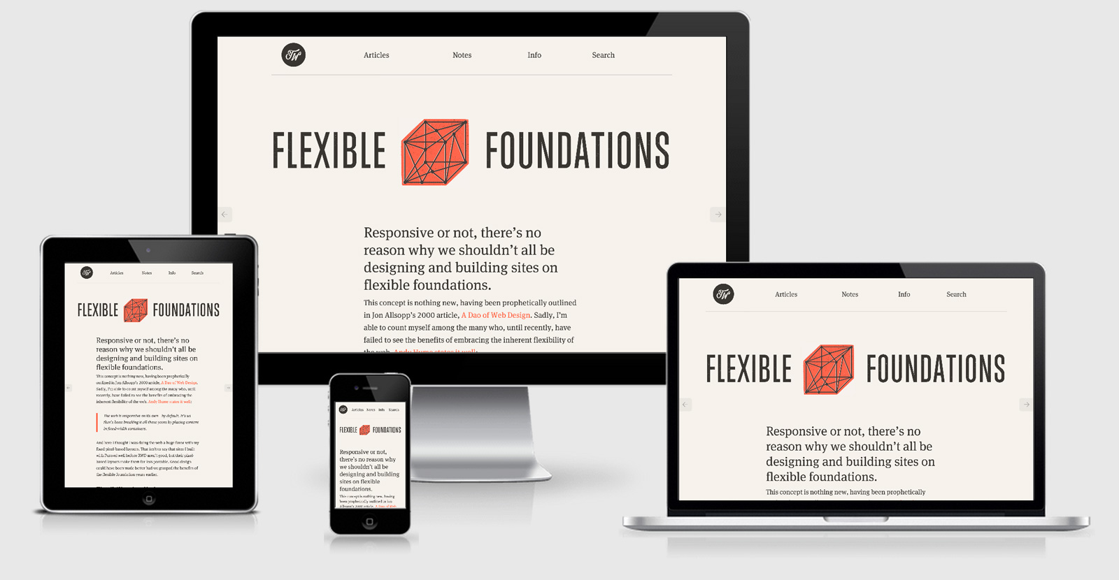
The other great thing is that the art direction is well thought out across multiple breakpoints as well, something you would certainly expect from 1/3 of the team that designed and delivered the very first Microsoft responsive homepage.
Looking through the CSS there are six different breakpoints that have nothing at all to do with device sizes, this is something that I’m really keen to see more of with everyones sites. The Media queries are repeated often throughout the stylesheet that indicates a preprocessor at work. While this
does extend the length of the file that all gets removed when GZIP is enabled (and it is).
In the times of Critical CSS Trent seems to ignore this approach but does put the CSS front and center as the very first thing that is requested and is the second line in the html document.
From a security point of view (not something that I would usually mention) Trent was leaving in the meta tag that shows the version of WordPress being used. This isn’t a gaping security hole, but it does give someone information about what he’s using which could be used to known exploits. He’s since fixed that up and for those of you that have this same issuesCSS Tricks has an easy fixfor you.
The logo is done with SVG meaning that it is light weight and will scale across any device and screen density/retina-ness.
All images are delivered through netdna-cdn.com on the homepage, although this seems to then remove the WordPress core feature of pushing out responsive image syntax so that is certainly something that should be looked into a little more (although the site is pretty fast, I’m just being picky now).
Checking on Webpage test shows that everything is green except for image compression, and even then it’s a C so passable (compressing a little further would get another 71kb saved).
For a slightly quicker page it could also include a
<link rel="dns-prefetch" href="//netdna-cdn.com ">
but because the first request is for the CSS on that domain it’s probably overkill (although I noticed that another DNS connection had to be made when requesting JS from the same domain, so maybe the connection is not being kept).
FitText and FitVids are both running on the site as well, which you would expect as Dave Rupert wrote them both.
Finally there is a LARGE number of apple icons included in the head, and a
manifest.json
file defined for the Android equivalents.
{
 "name": "App",
 "icons": [
  {
   "src": "/android-icon-36x36.png",
   "sizes": "36x36",
   "type": "image/png",
   "density": "0.75"
  },
  {
   "src": "/android-icon-48x48.png",
   "sizes": "48x48",
   "type": "image/png",
   "density": "1.0"
  },
  {
   "src": "/android-icon-72x72.png",
   "sizes": "72x72",
   "type": "image/png",
   "density": "1.5"
  },
  {
   "src": "/android-icon-96x96.png",
   "sizes": "96x96",
   "type": "image/png",
   "density": "2.0"
  },
  {
   "src": "/android-icon-144x144.png",
   "sizes": "144x144",
   "type": "image/png",
   "density": "3.0"
  },
  {
   "src": "/android-icon-192x192.png",
   "sizes": "192x192",
   "type": "image/png",
   "density": "4.0"
  }
 ]
}
Trent Walton Technical Details
Site Meta Tag
<meta name="viewport" content="width=device-width, initial-scale=1.0"/>Media Queries
@media (min-width: 400px) { }
@media (min-width: 600px) { }
@media (min-width: 800px) { }
@media (min-width: 1030px) { }
@media (min-width: 1250px) { }
@media (min-width: 1400px) { }
 A notebook you'll actually carry every day.
