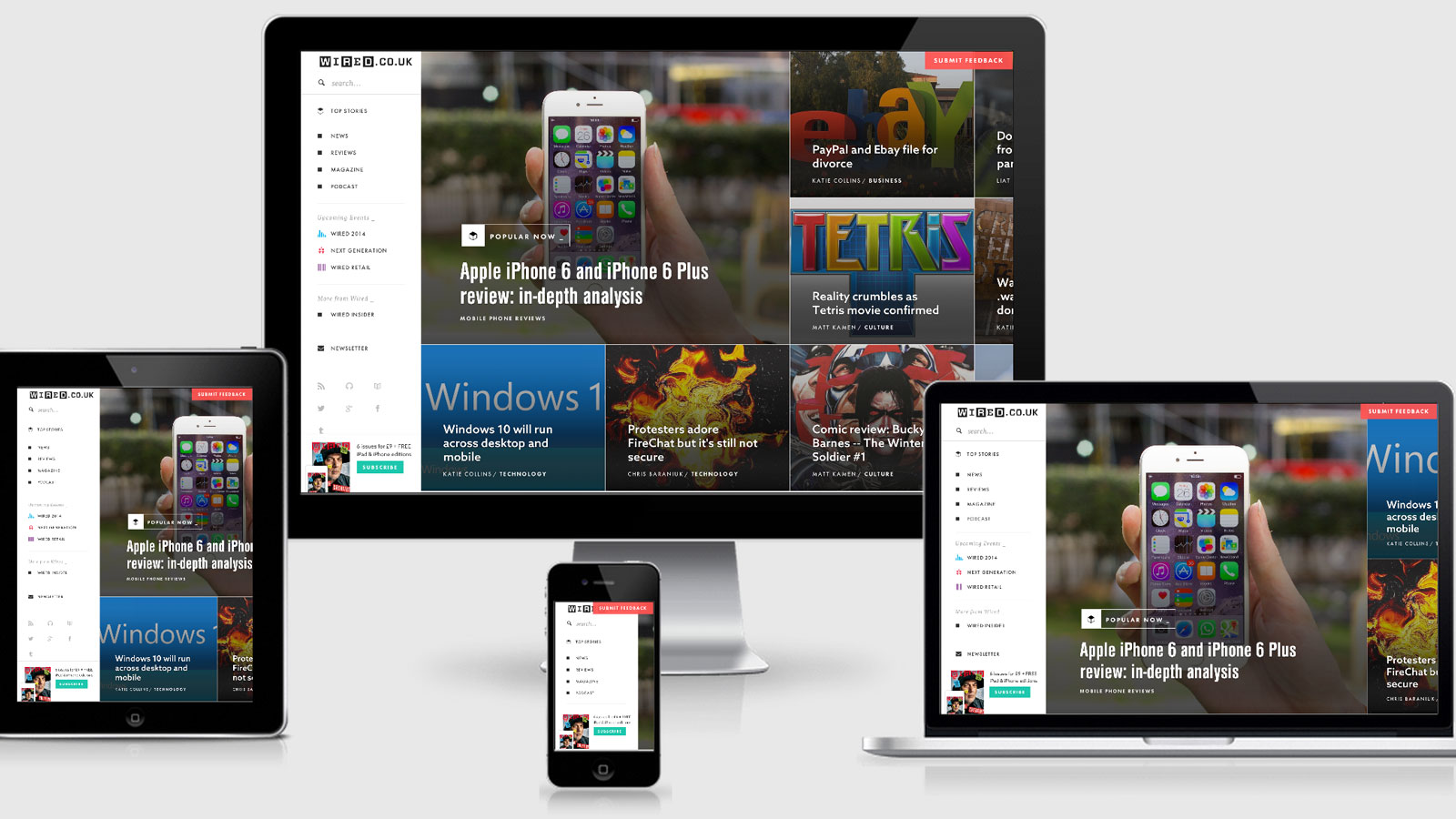
Wired

Wired uses javascript to provide a different layout depending on mobile and orientation. They do use media queries for this as well (as you can see from the large number of vertical media queries) however appears to be removing scroll bars and tidying up some layout issues.
The way they are serving images a is also very interesting. It usedata-attributes on the img tag that has some interesting affects. I would usually assume the src will download by default however it seems that on mobile devices the smallest version of the image is the only image that loads whereas
on the desktop I get a double download. The HTML for the image is as follows
<img alt="" class=" customImgSrc" data-aspectratio="1.5" data-maxheight="1280" data-maxwidth="1920" data-srcSizeData="{"values":[{"width":1240,"height":826,"url":"http://cdni.wired.co.uk/1240x826/d_f/firephotoshop.jpg"},{"width":1920,"height":1280,"url":"http://cdni.wired.co.uk/1920x1280/d_f/firephotoshop.jpg"}]}" src="http://cdni.wired.co.uk/1240x826/d_f/firephotoshop.jpg" />
Wired Technical Details
Site Meta Tag
<meta name="viewport" content="width=device-width,user-scalable=no,minimum-scale=1.0,maximum-scale=1.0,minimal-ui" />Media Queries
@media screen and (max-device-width: 480px) { }

@media screen and (min-width: 0) { }

@media screen and (min-width: 0) and (min-width: 768px) { }

@media screen and (min-width: 0) and (min-width: 600px) {}

@media screen and (min-width: 768px) { }

@media screen and (min-width: 600px) { }

@media screen and (min-width: 400px) { }

@media screen and (min-height: 700px) { }

@media screen and (min-height: 750px) { }

@media screen and (min-height: 800px) { }

@media screen and (min-height: 850px) { }

@media screen and (min-height: 900px) { }

@media screen and (min-height: 950px) { }

@media screen and (min-height: 1000px) { }

@media screen and (min-height: 1050px) { }

@media screen and (min-height: 1100px) { }

@media screen and (max-width: 600px) { }

@media screen and (min-width: 480px) { }

@media screen and (min-width: 1600px) { }

@media screen and (min-width: 1024px) { }

@media screen and (min-width: 640px) { }
 A notebook you'll actually carry every day.

