Font Shop
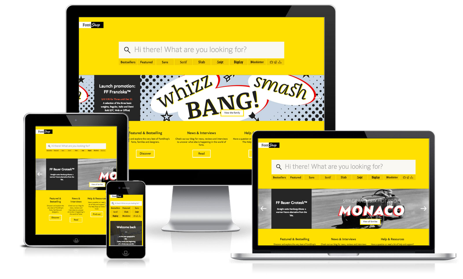
The redesign of the site is unsurprisingly beautiful. There are a few progressive enhancements that could be made, in particular adding a typeahead to the HUGE search bar smacked in the middle of the page.
CSS & Javascript
CSS has so many selectors that a special implementation to avoid issues with IE has been done in the using conditional comments. It’s no wonder that something had to be done with the CSS weighing in a 816kb minified and crashing CSSEdit when I tried to reformat it to a readable format.
A custom version of modernizr is loaded looking for the following browser capabilities: -flexbox-flexboxlegacy-csscolumns-csstransforms-csstransforms3d-csstransitions-input-localstorage-touch-shiv-cssclasses-prefixed-teststyles-testprop-testallprops-prefixes-domprefixes-css_vhunit-css_vwunit-load.
It’s not uncommon for most sites to come with jQuery, however the homepage of FontShop contains the entire file included inline in the footer. This does save a HTTP request, however they then call a jquery.fontloader js file and an external Zendesk JS file which seem better to be concatenated together to save the extra request.
They also use Owl Carousel which is one I need to add to the list of resources on this site now.
Font Shop Technical Details
Site Meta Tag
<meta content="width=device-width, initial-scale=1.0, maximum-scale=1.5" name="viewport" />Media Queries
@media (min-width: 30em){}
@media (max-width: 47.9375em){}
@media screen and (min-width: 48em){}
@media screen and (min-width: 64em){}
@media only screen and (max-width: 767px){}
@media only screen and (min-width: 768px) and (max-width: 1023px){}
@media only screen and (min-width: 1024px) and (max-width: 1919px){}
@media only screen and (min-width: 1920px){}
@media screen and (-webkit-min-device-pixel-ratio: 1.5), screen and (min-resolution: 144dppx), screen and (min-resolution: 1.5dppx){}
@media (min-width: 18.75em){}
@media (min-width: 100em){}
@media (max-width: 20em){}
@media (max-width: 63.9375em){ }
@media screen and (min-width: 48em) and (min-height: 48em){}
@media (max-width: 29.9375em){}
@media (min-width: 35.5em){}
@media (max-width: 35.4375em){}
@media (min-width: 31.25em){}
@media (min-width: 10em){}
@media (min-width: 20em){}

@media (min-width: 30em){}

@media (min-width: 40em){}

@media (min-width: 50em){}

@media (min-width: 60em){}

@media (min-width: 70em){}

@media (min-width: 80em){}

@media (min-width: 90em){}

@media (min-width: 100em){}

@media (min-width: 110em){}

@media (min-width: 120em){}

@media (min-width: 130em){}

@media (min-width: 140em){}

@media (min-width: 150em){}

@media (min-width: 160em){}

@media (min-width: 0em){}
@media (min-width: 48em) and (min-width: 10em){}

@media (min-width: 48em) and (min-width: 20em){}

@media (min-width: 48em) and (min-width: 30em){}

@media (min-width: 48em) and (min-width: 40em){}

@media (min-width: 48em) and (min-width: 50em){}

@media (min-width: 48em) and (min-width: 60em){}

@media (min-width: 48em) and (min-width: 70em){}

@media (min-width: 48em) and (min-width: 80em){}

@media (min-width: 48em) and (min-width: 90em){}

@media (min-width: 48em) and (min-width: 100em){}

@media (min-width: 48em) and (min-width: 110em){}

@media (min-width: 48em) and (min-width: 120em){}

@media (min-width: 48em) and (min-width: 130em){}

@media (min-width: 48em) and (min-width: 140em){}

@media (min-width: 48em) and (min-width: 150em){}

@media (min-width: 48em) and (min-width: 160em){}

@media (min-width: 48em) and (min-width: 0em){}
 A notebook you'll actually carry every day.