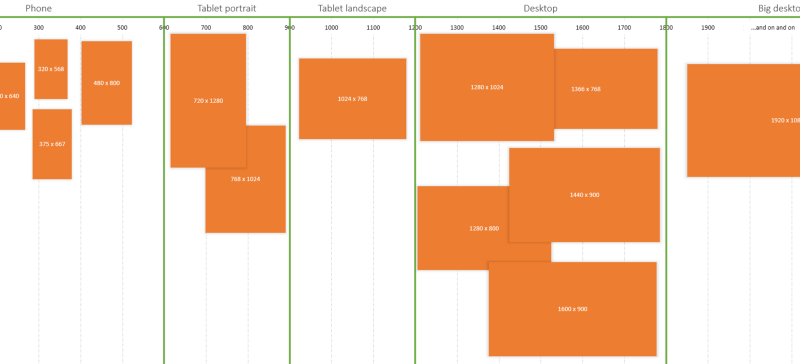
Logical Breakpoints For Your Responsive Design
 A notebook you'll actually carry every day.
A great look at the readability of responsive design and an examination into how you might go about determining when a particular viewport is “broken”. Word lengths are different for different languages so a wider column may be required to maintain a good measure.
There are several tactics for deciding where to put breakpoints in a responsive design. There is the rusty idea that they should be based on common screen sizes, but this doesn’t scale well.There are no “common” screen sizes. Another popular tactic is to create a breakpoint wherever the layout breaks.
An excerpt from Logical Breakpoints For Your Responsive Design