The 100% correct way to do CSS breakpoints
 A notebook you'll actually carry every day.
An excellent way to approach responsive breakpoints in your next redesign. I’ve said it many times before that you shouldn’t focus your breakpoints on specific device widths because tomorrow will always have a new device with a new set of dimensions. Focus on your content!
It seems this article disagrees with the content specific approach, though, or at least regarding maintainability. In the case of complex sites with lots of different content, the suggestion is to pick a set of breakpoints (not based on devices) and just stick to them. I think that’s a bit of a cop out and while it does make the site easier to maintain, that’s your problem and not the users.
We should be providing the content in the best possible way to all our users, and if that means the codebase is a little harder to maintain then it’s is a little harder to maintain. If it means you have less time to produce the content then maybe have a rethink about your design approach.
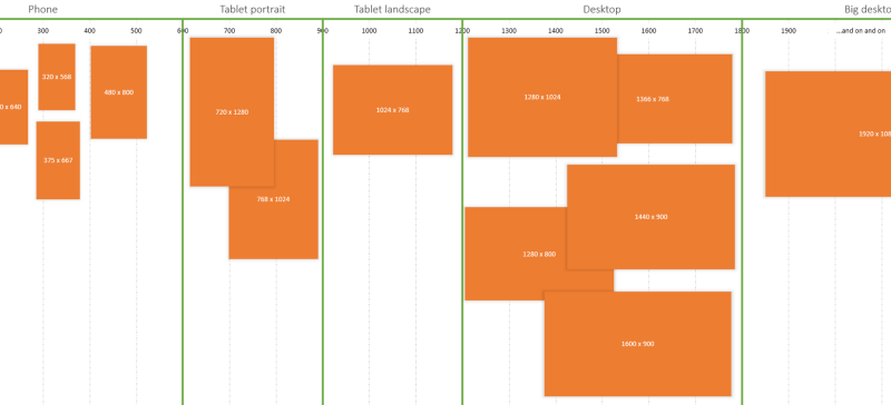
For complex sites, life is much easier if you pick a handful of breakpoints to use across the site
An excerpt from The 100% correct way to do CSS breakpoints
