Case Study: My First Practical CSS Grid Layout
The takeaway from this exercise is that CSS Grid Layout is awesome, and we are barely scratching the surface of its capabilities. It’s also heartening to know every browser that supports Grid also supports feature queries, so we can probably start using it sooner than expected.

I was provided page content with this priority:
- Introductory text
- Actionable links organized into two sections
- Deeper explanatory text
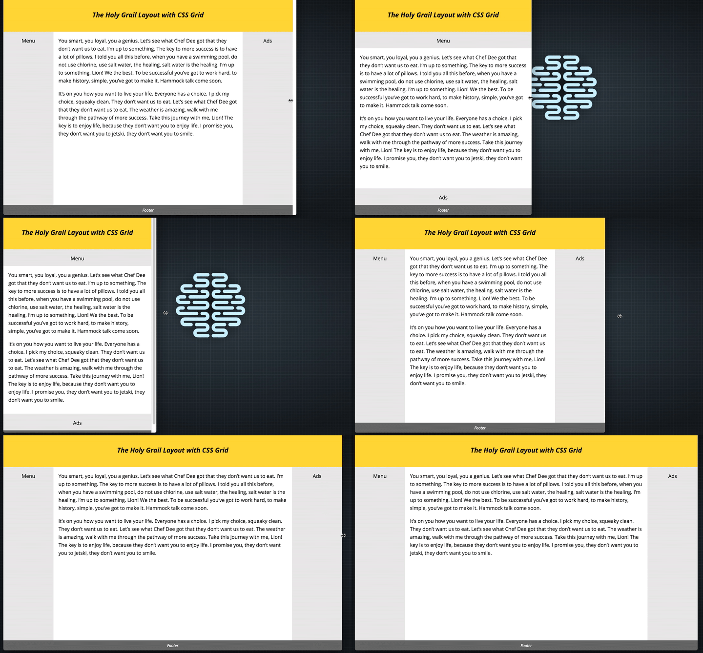
As space allows, I want the link sections to display side by side, with equal heights for balance. At wider viewports, I’d like those sections to occupy a sidebar, with all the prose content flowing together in the remaining space.
An excerpt from Case Study: My First Practical CSS Grid Layout
 A notebook you'll actually carry every day.


