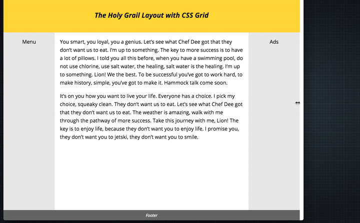
The Holy Grail Layout with CSS Grid
 A notebook you'll actually carry every day.
In March last year Ire wrote a cool little tutorial on using CSS Grid to achieve the old three column layout which was dubbed “The Holy Grail Layout” in the early 2000’s. The wonderful thing is that Grid is now literally around the corner so it’s time to start getting familiar with the approach.
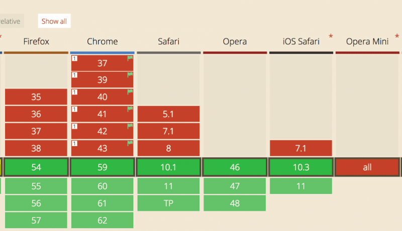
The CSS Grid Layout Module, although still in Editor’s Draft, is nearing finalisation. We can now enable it in a number of browsers for testing and help figure out any bugs it may have.
The CSS Grid Layout is really complex, even more so than Flexbox. It has 17 new properties and introduces a lot of new concepts around the way we write css. So, in an attempt to wrap my head around this new specification and figure out how it works, I used it to create the Holy Grail Layout.
An excerpt from The Holy Grail Layout with CSS Grid