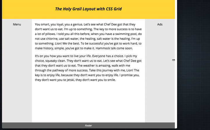
Changes to the Grid Spec and taking on Multi-Column layout
 A notebook you'll actually carry every day.
The properties for defining the grid gap is going to be changed and will be dropping the prefix ‘grid-‘ and just have column-gap, row-gap and gap. This is great because it provides the ability to extend the declarations to things like Flexbox. Rachel is also taking over the multi-column spec, something which is desperately missing in CSS layouts.
The resolution for the original issue is that the
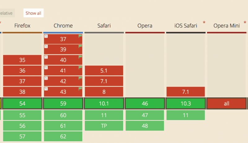
An excerpt from Changes to the Grid Spec and taking on Multi-Column layoutgridshorthand will be changed to not reset these properties. Furthermore, the gap properties were discussed and it was resolved to undo the original resolution that made specificgrid-gapproperties (grid-column-gap,grid-row-gapandgrid-gap) in favour ofcolumn-gap,row-gapand agapshorthand. There is an issue raised here 1696 although the actual resolution is detailed in the discussion of 1036 above.