Foundational Ideas for Responsive Augmented Reality Content
By now you will likely have a good idea of the basic concepts of responsive design, looking at the viewport size and changing the layout of the content based on the constraints. This is fine for two dimensions, but what about when we look at three? This article looks at the start of how we understand the different constraints and issues that an AR environment provides, and the follow-up article (at the bottom of this article) then goes on to explain how to develop them in Torch (you don’t have to use Torch to make this, the concept is what is great about this).

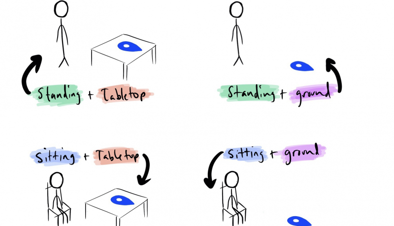
When beginning to arrange elements of an AR experience, questions of ergonomics threaten to derail the process from the onset. Will the audience sit when they interact with my work? Will they stand? Kneel? Where will they center the experience? On a table? On the floor? On a wall?
This short list of questions should precipitate even the most conservative designers into second guessing themselves. After all, the answers to each will change how the designed experience is viewed by the audience. This also changes the requirements before we’ve defined them.
An excerpt from Foundational Ideas for Responsive Augmented Reality Content
 A notebook you'll actually carry every day.


