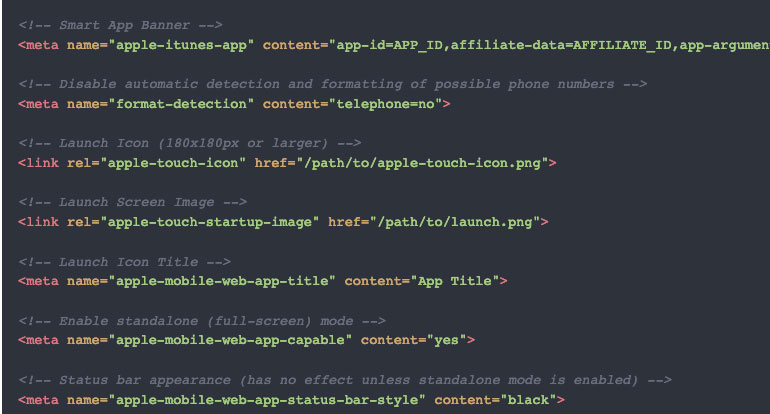
Simplified Fluid Typography
 A notebook you'll actually carry every day.
I loved it when we could declare different font sizes between breakpoints to have the best typography for the given width, but when the typography locks were introduced things go a whole lot better.
Fluid typography is the idea that
font-size(and perhaps other attributes of type, likeline-height) change depending on the screen size (or perhaps container queries if we had them).The core trickery comes from viewport units. You can literally set type in viewport units (e.g.
font-size: 4vw), but the fluctuations in size are so extreme that it’s usually undesirable. That’s tempered by doing something likefont-size: calc(16px + 1vw). But while we’re getting fancy with calculations anyway, the most common implementation ended up being an equation to calculate plain English:An excerpt from Simplified Fluid TypographyI want the type to go between being 16px on a 320px screen to 22px on a 1000px screen.

