A Dynamically-Sized Sticky Sidebar with HTML and CSS
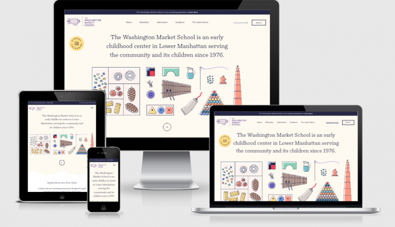
 A notebook you'll actually carry every day.
I’ve literally come across this exact same issue today, except the pattern we’re using is a little more like the pattern you see on https://diversity.fb.com/initiatives/at-facebook/. I’ll also be looking at implementing this sticky approach on the cart element on the Back Pocket Notebooks site as well.
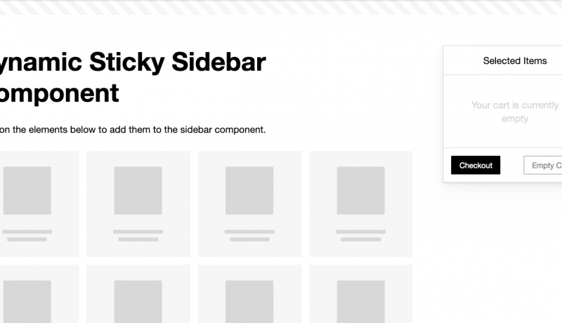
The layout styling was as easy to implement as I had mentioned earlier. But there was a catch: The height of the component would vary based on its content. I could have capped it with a
An excerpt from A Dynamically-Sized Sticky Sidebar with HTML and CSSmax-heightand setoverflow-y: autoto make the component content scrollable. This worked well on my laptop screen and my typical viewport height, but in a smaller viewport with less vertical real estate, the sidebar’s height would exceed the viewport.