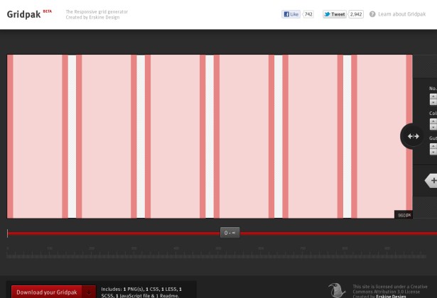
Gridpak
What is it?
Gridpak is the starting point for your responsive projects, improving your workflow and saving time. Create your responsive grid system once using the simple interface and let Gridpak do the heavy lifting by generating PNGs, CSS and JavaScript.
Why should I use it?
We think it’s the best and most flexible way to devise a responsive layout. You control every aspect of the grid from column padding to where ‘break points’ occur. Our simple interface makes it quick and easy to visualise your responsive grid system and output it in the formats you need to make a lightning quick start to any project.
Compatibility
The CSS that Gridpak generates is compatible with IE 8+, however it makes use of some more experimental CSS properties such as the media query, box-sizing and background-clipproperties so we suggest using it in conjunction with a library such as Modernizr to ensure backwards compatibility.
Video Introduction
 A notebook you'll actually carry every day.