Media Query Bookmarklet
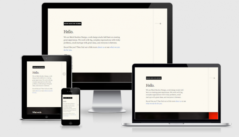
When building responsive web design sites it is not always practical to test the design on different devices as you go. A much easier solution is to drag your browser window to quickly test the changes are working and look as they should before moving to specific device testing (although we don’t recommend building media query break points for devices).
Thankfully the clever guys over at Sparkbox did something about it and created this mediaQuery Bookmarklet that will show you the viewport width in both pixels and em’s so you know EXACTLY when the media query is firing. An added bonus is that at any time it shows all of the currently active media queries, great to ensure that your queries are firing when expected.
One thing that I quickly noticed when we started building responsive websites was that we were constantly resizing our browsers. We would resize the browser to the largest media query, and then step down and watch the changes so we knew what media query we were looking at. This is not a good way to
design a website. I figured that if we had a tool that would show us exactly what size the viewport was, we would know what media queries would be active. Taking it one step further, I thought why shouldn’t the tool just tell me which media query just fired?
 A notebook you'll actually carry every day.